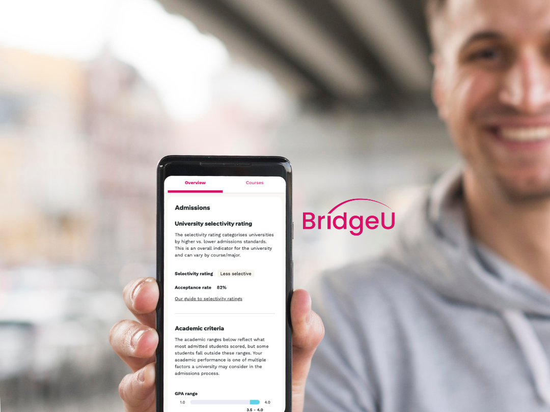
Who are PolicyMogul?
PolicyMogul is the UK's most comprehensive and real-time political monitoring, influence and stakeholder mapping platform. Organisations, parliamentarians and public officials use PolicyMogul to keep up to date with tailored developments from Parliament, Government and the wider policy-forming arena.
The brief
PolicyMogul needed two main deliverables;
1. A clear and concise website delivering transparency around, what can be a complex product and clear pricing structure to help build new business.
2. A design system to apply to their current work-in-progress product
2. A design system to apply to their current work-in-progress product
Business objectives
- Product launch aligned to business launch
- Drive sign ups
- Cross-platform look and feel consistency
- Drive sign ups
- Cross-platform look and feel consistency
Stakeholder kickoff for clear alignment
To kickstart the project, a key stakeholder session took place over one day with investors, the CEO and Policy Mogul staff in order to understand the product and business in depth.
- Issues were raised around the pricing model - which had not been properly defined
- Relevancy of family historic past - a key priority of Policy Mogul before the session.
The outputs of this session gave us clear tasks:
- The business needed to define the pricing model and then we would need to interpret how this will be communicated on the site to users
- Need to consider how to communicate functionality to parliamentarians as well as paying users
- The new branding for the site needed to sit alongside product components
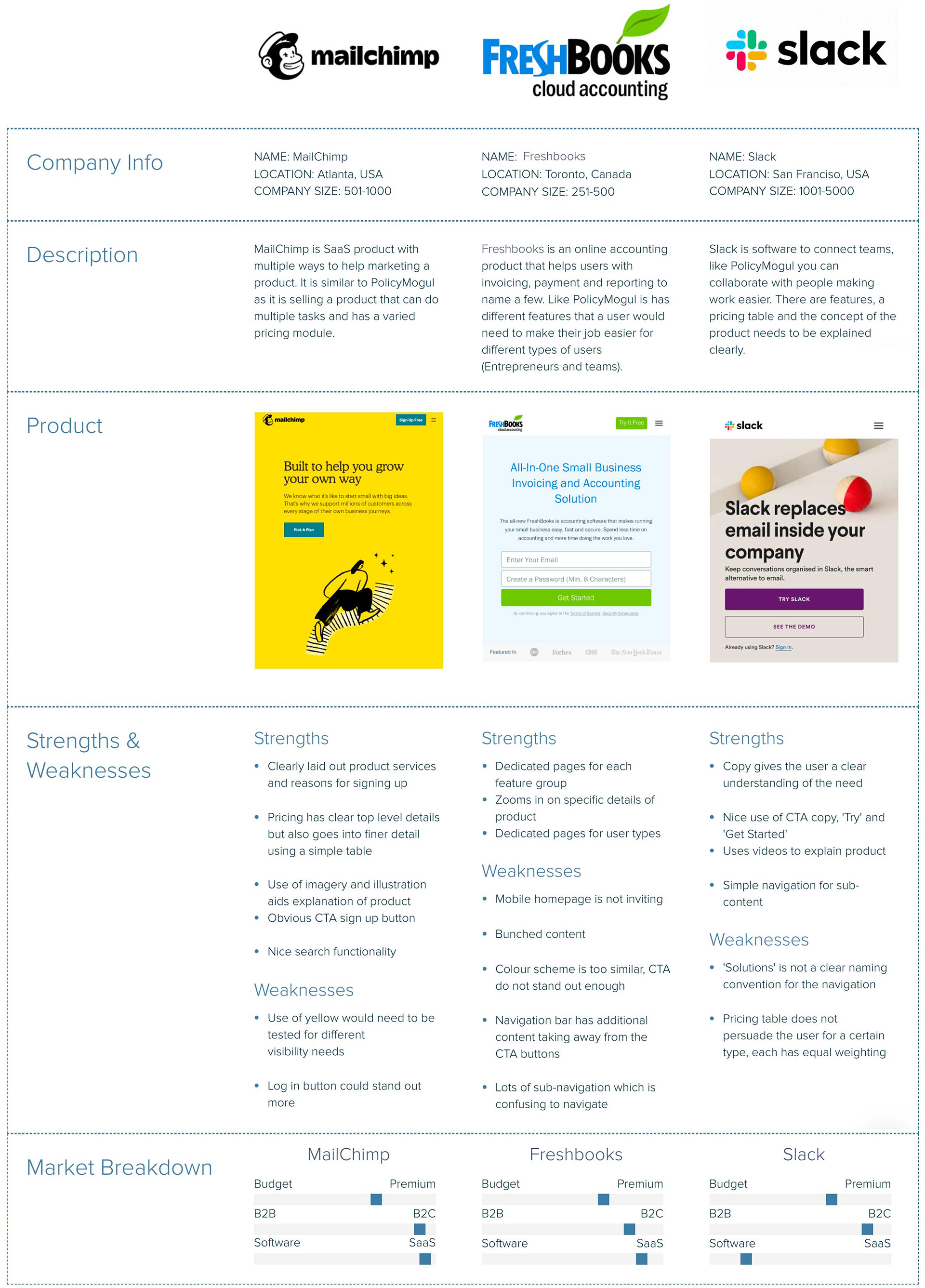
Comparative analysis
Policy Mogul is a start-up company with no direct industry competitors. Therefore, instead of competitive anal, I conducted comparative studies; concentrating on design systems for SaaS products and their websites, hoping to understand:
- How do they sell a SaaS product?
- What is their communication delivery on pricing and service?
- What are the common adopters?
- What is their communication delivery on pricing and service?
- What are the common adopters?
Information gathered from this research helped form ideas for the wireframes.
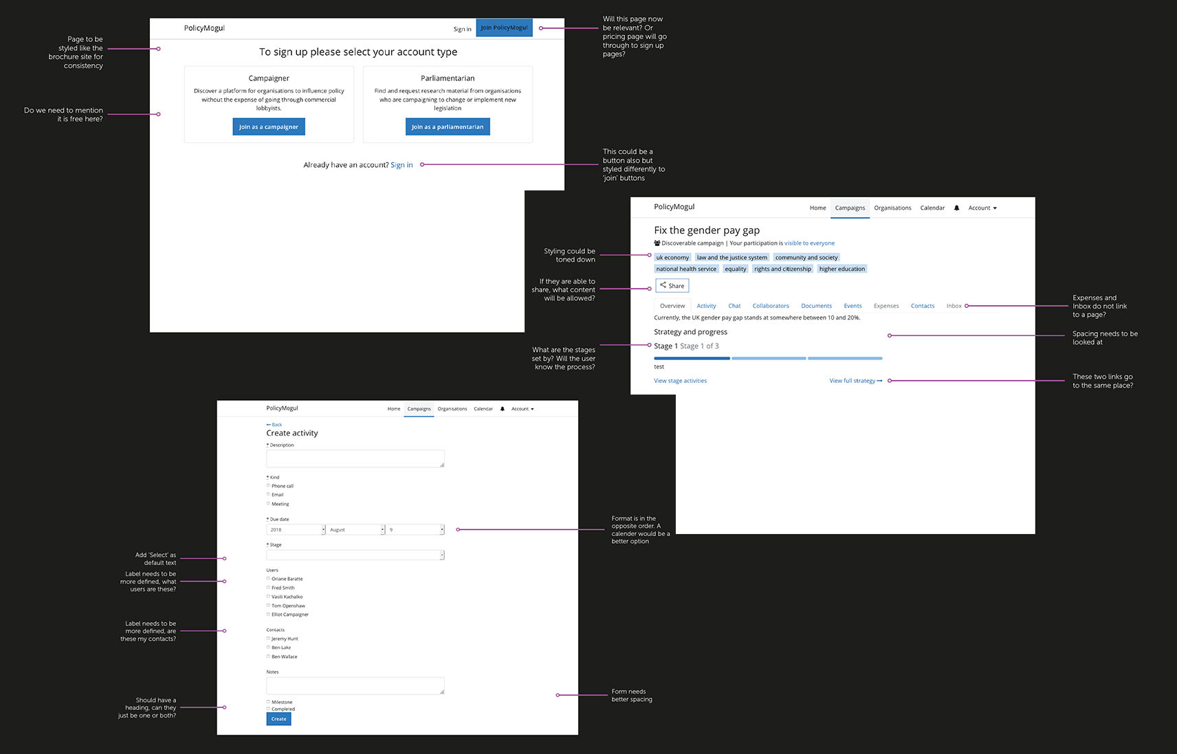
Product UX audit
To better understand the product, I was given access to the beta prototype, which had been started by a separate agency.
I used this as an opportunity to review the product for the following:
1. Does it meet the users’ needs, user journeys, UX principles,
2. Usability and responsive components used
Once I had concluded this audit, I was able to provide clearer direction on the design next steps and understand the challenges of the project.
2. Usability and responsive components used
Once I had concluded this audit, I was able to provide clearer direction on the design next steps and understand the challenges of the project.
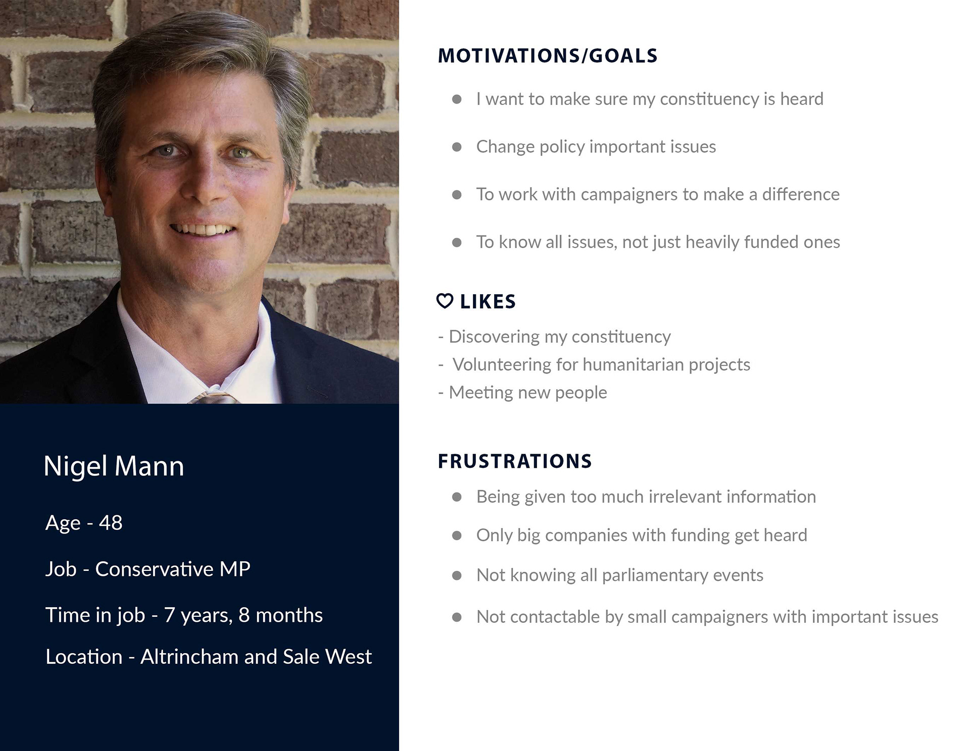
Understanding the user
To identity the user types who will be looking at the site, two key personas were created, one to represent the campaigner who will be paying for the product and a PM who will be given free access to the product but who would need key reasons in order to register. Both are vital user types and are needed for the product to be a success.
Challenges of the user types - explaining the pricing modal
There were two main audiences that needed to be taken into account when designing the website, those who were buying the product and politicians who were given the product for free but beneficial reasons for them signing up needed to be clear.
Another challenge was to make sure the pricing structure was laid out effectively and easy to understand the differences between not only the types of accounts but billing monthly and annually.
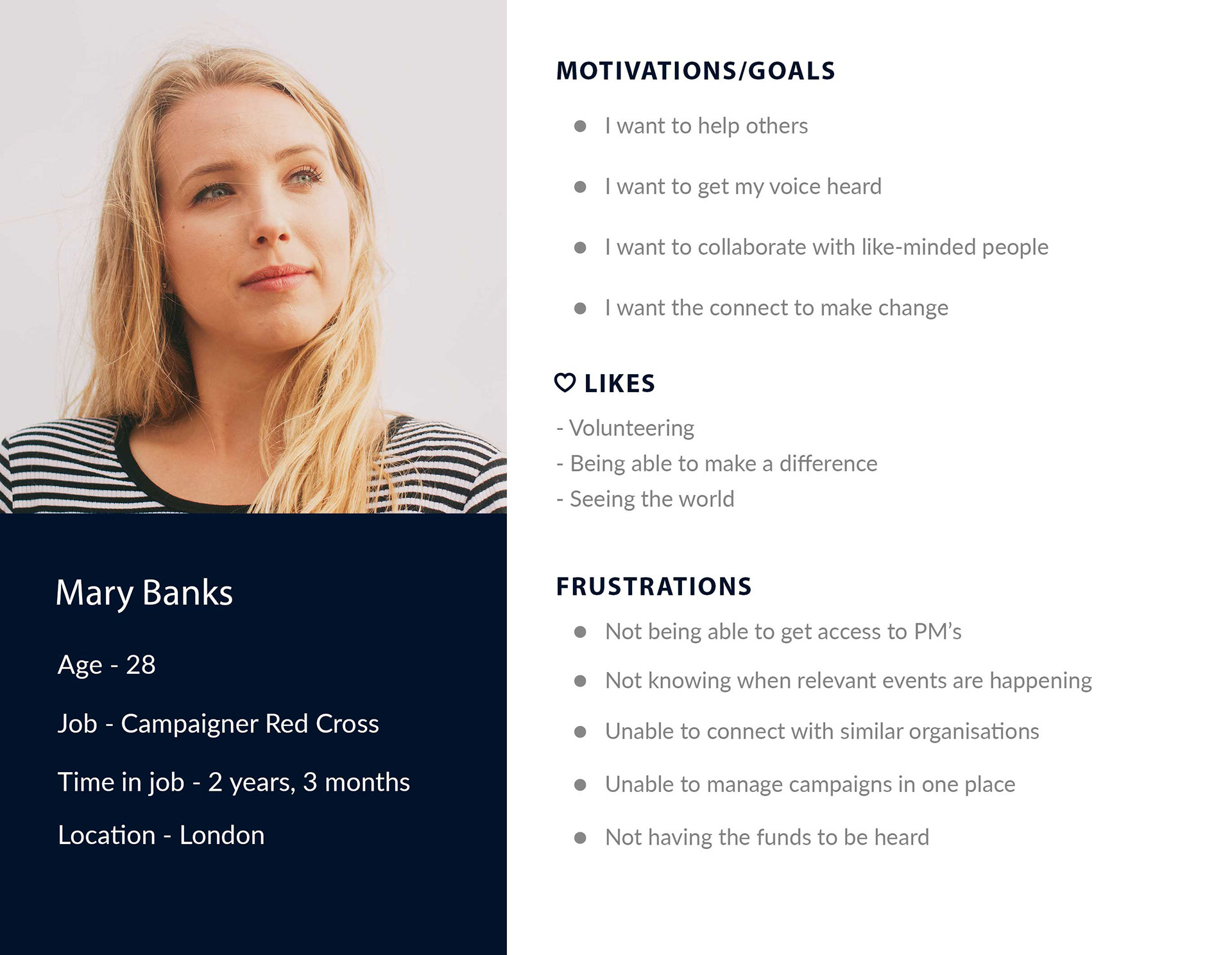
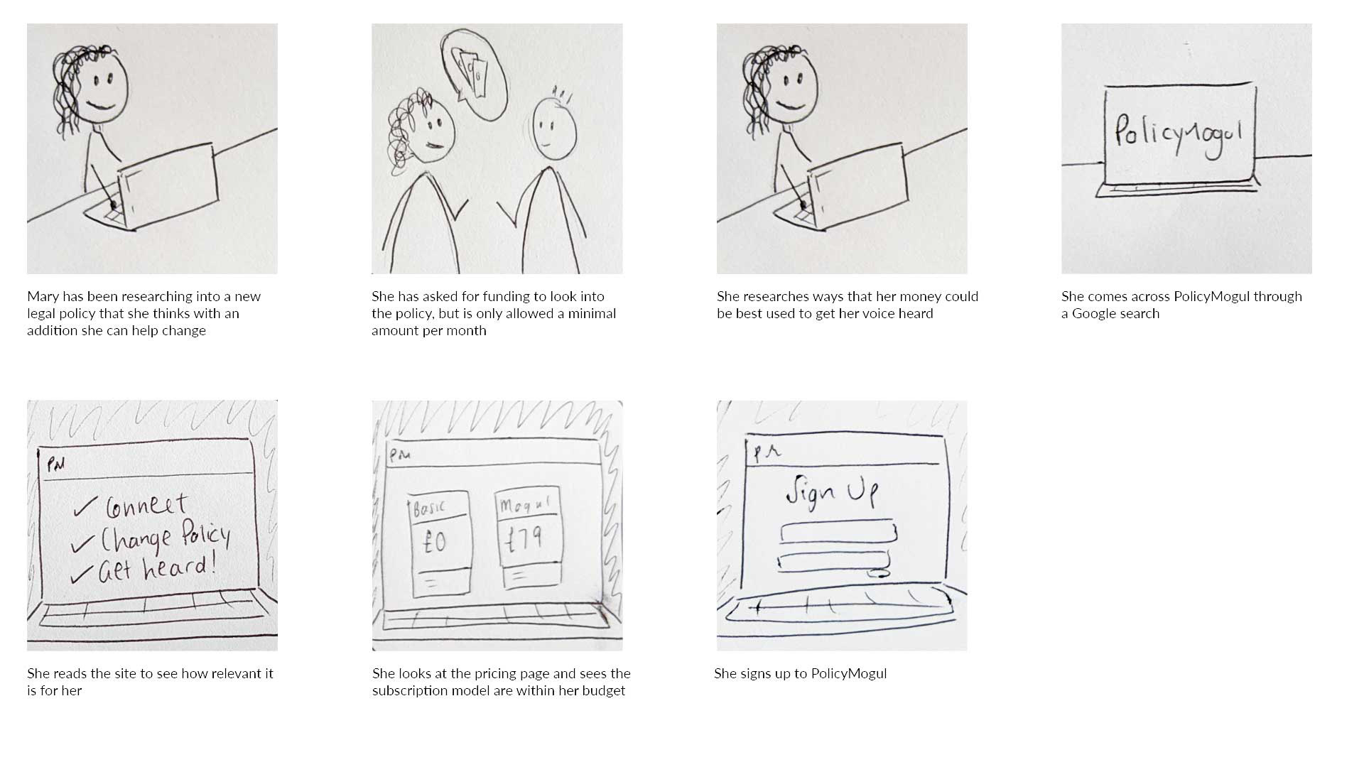
Scenarios to understand the user needs
Scenario 1
Mary is at work and thinking about getting a new piece of legalisation through that can help people with a major UK crisis situation. She is very passionate but has minimal funding to get her idea in front of the correct PM and looks for a service online that could help her.
Requirement
• List ways the product is beneficial for small campaigners to get access to PM’s
• Make sure the PolicyMogul site clearly states how it can help small campaigners
• Set out a clear pricing structure
• List ways the product is beneficial for small campaigners to get access to PM’s
• Make sure the PolicyMogul site clearly states how it can help small campaigners
• Set out a clear pricing structure
--
Scenario 2
Nigel has just come back to work from a family break and has a large pile of post on his desk from campaigners, he knows that some of the post is important to his constituency but finds it difficult to find the time to read it all. He has made it known that he likes to listen to large and small campaigners and has been sent the PolicyMogul website via text to help find relevant campaigns.
Nigel has just come back to work from a family break and has a large pile of post on his desk from campaigners, he knows that some of the post is important to his constituency but finds it difficult to find the time to read it all. He has made it known that he likes to listen to large and small campaigners and has been sent the PolicyMogul website via text to help find relevant campaigns.
Requirement
• Identify why the site is good for PM’s and that it is free to use
• List how the site can benefit PM’s in order for them to sign up
• Make it clear that both large and small campaigners get their voices heard equally
• Make sure the site is mobile friendly
• Identify why the site is good for PM’s and that it is free to use
• List how the site can benefit PM’s in order for them to sign up
• Make it clear that both large and small campaigners get their voices heard equally
• Make sure the site is mobile friendly
A story board was created to see the needs of a campaigner when accessing the site, this insight helped us in terms of content and hierarchy for a user.
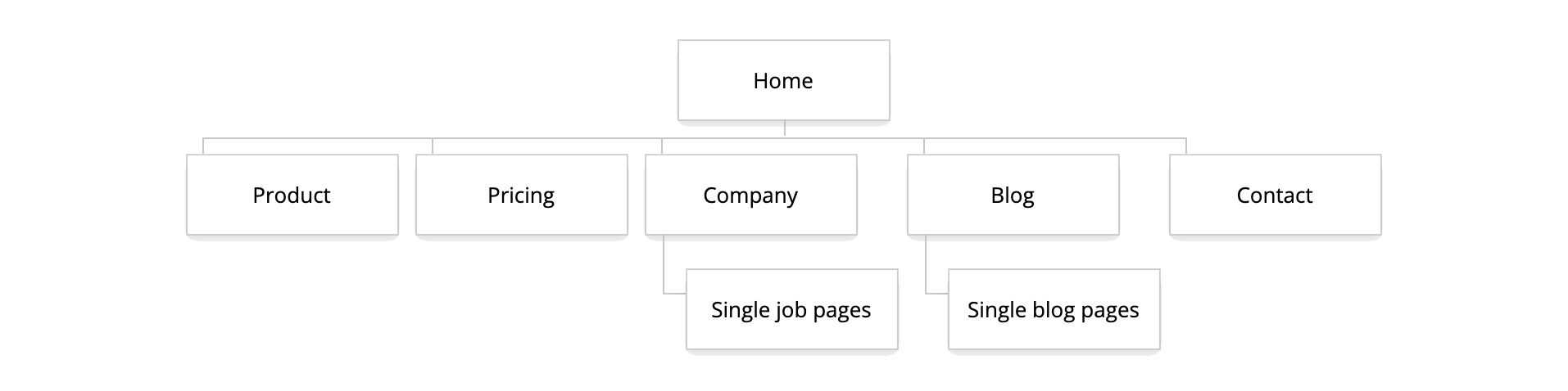
Creating the information architecture
A sitemap was created to maximise SEO benefits and ensure menus were easily navigable by all user types. Pages were optimised to deliver content in easily digestible segments, placed within suitable page categories and reviewed with the client at several points.
The result below hosted all content needed for the product launch.
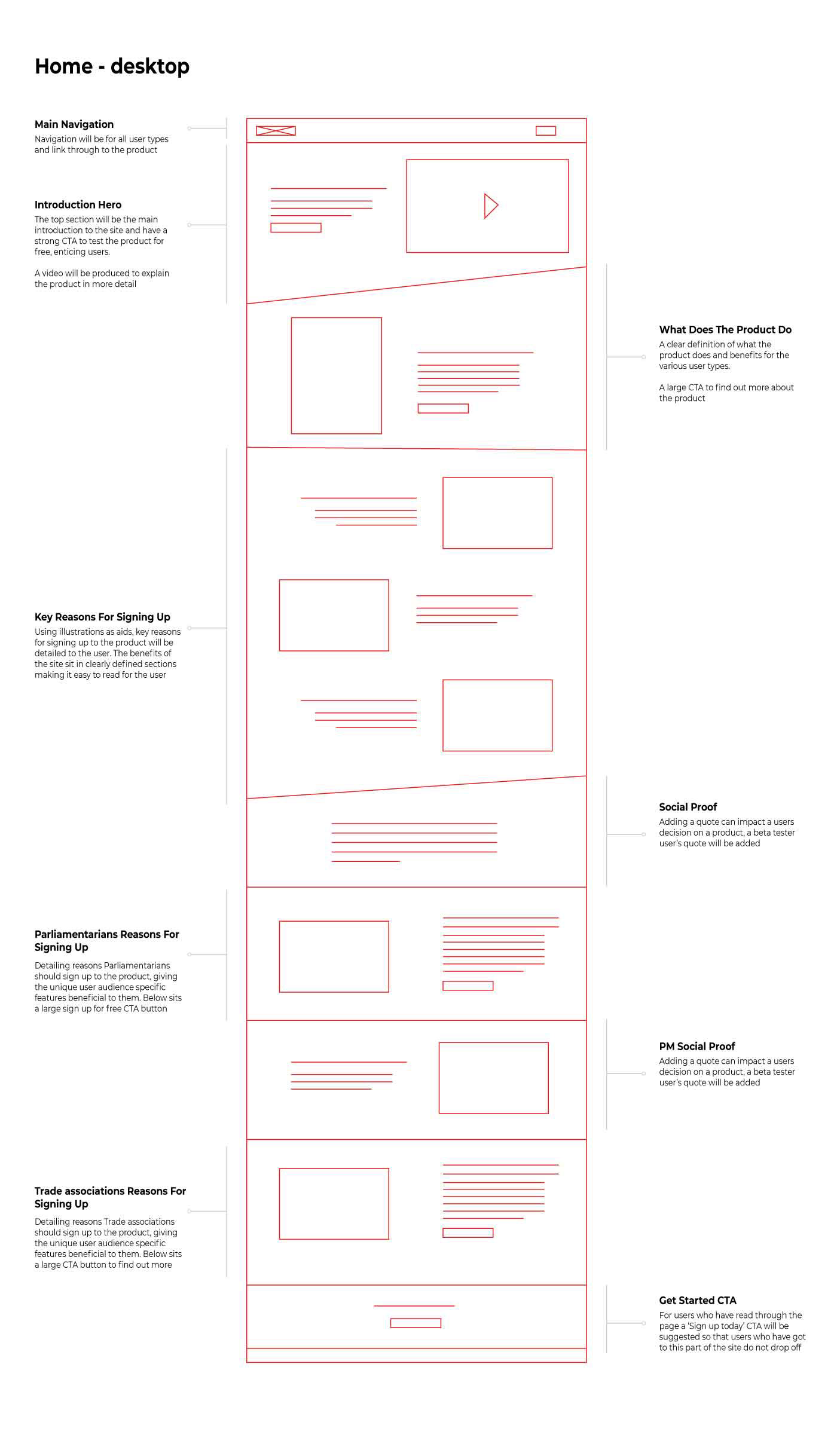
Wireframing highlighting issues with the pricing modal
For each page within the sitemap wireframes were created in mobile, tablet and desktop form. The wireframes were based on research conducted in the discovery phase of the project (including; competitor, scenarios and storyboard exercises) as well as stakeholder discussions.
For each page within the sitemap wireframes were created in mobile, tablet and desktop form. The wireframes were based on research conducted in the discovery phase of the project (including; competitor, scenarios and storyboard exercises) as well as stakeholder discussions.
This showed issues within the pricing page, the table feature that is commonly used on desktop did not translate well onto mobile and an alternative route for mobile had to be adopted. This was spotted early on within the wireframes and was rectified before problems arose in development.

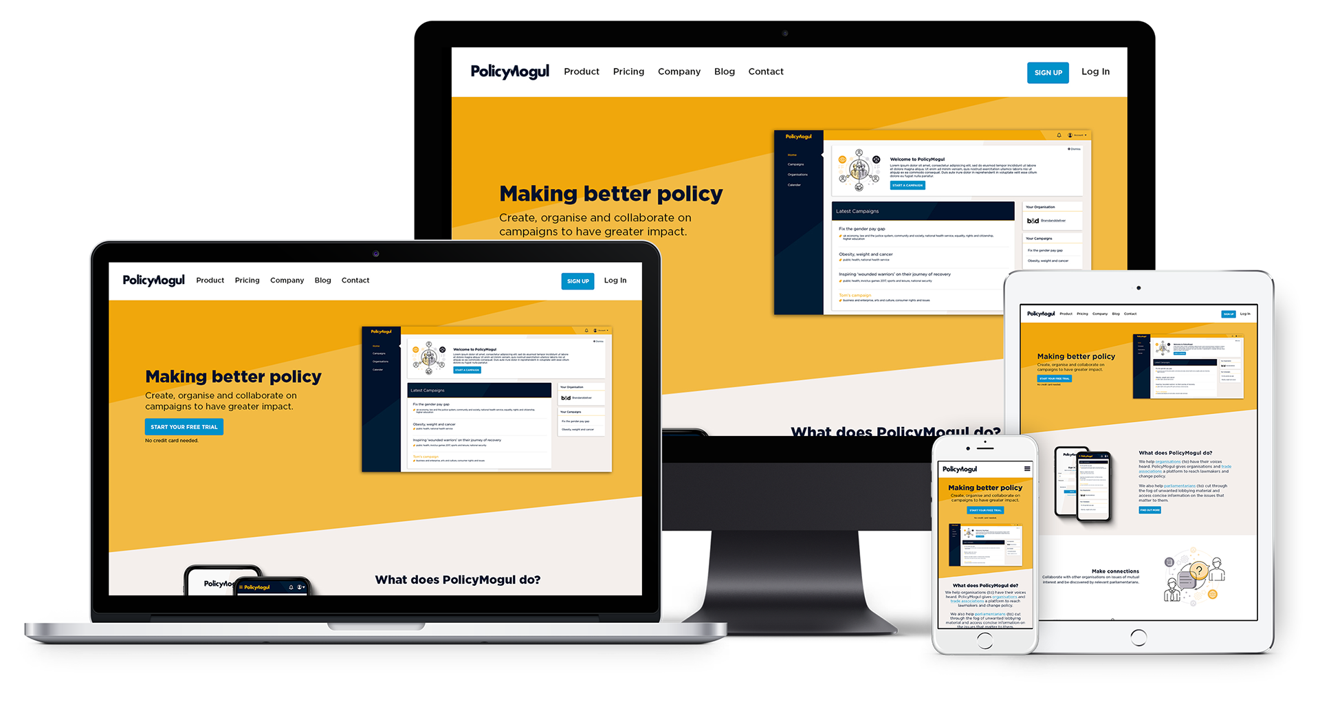
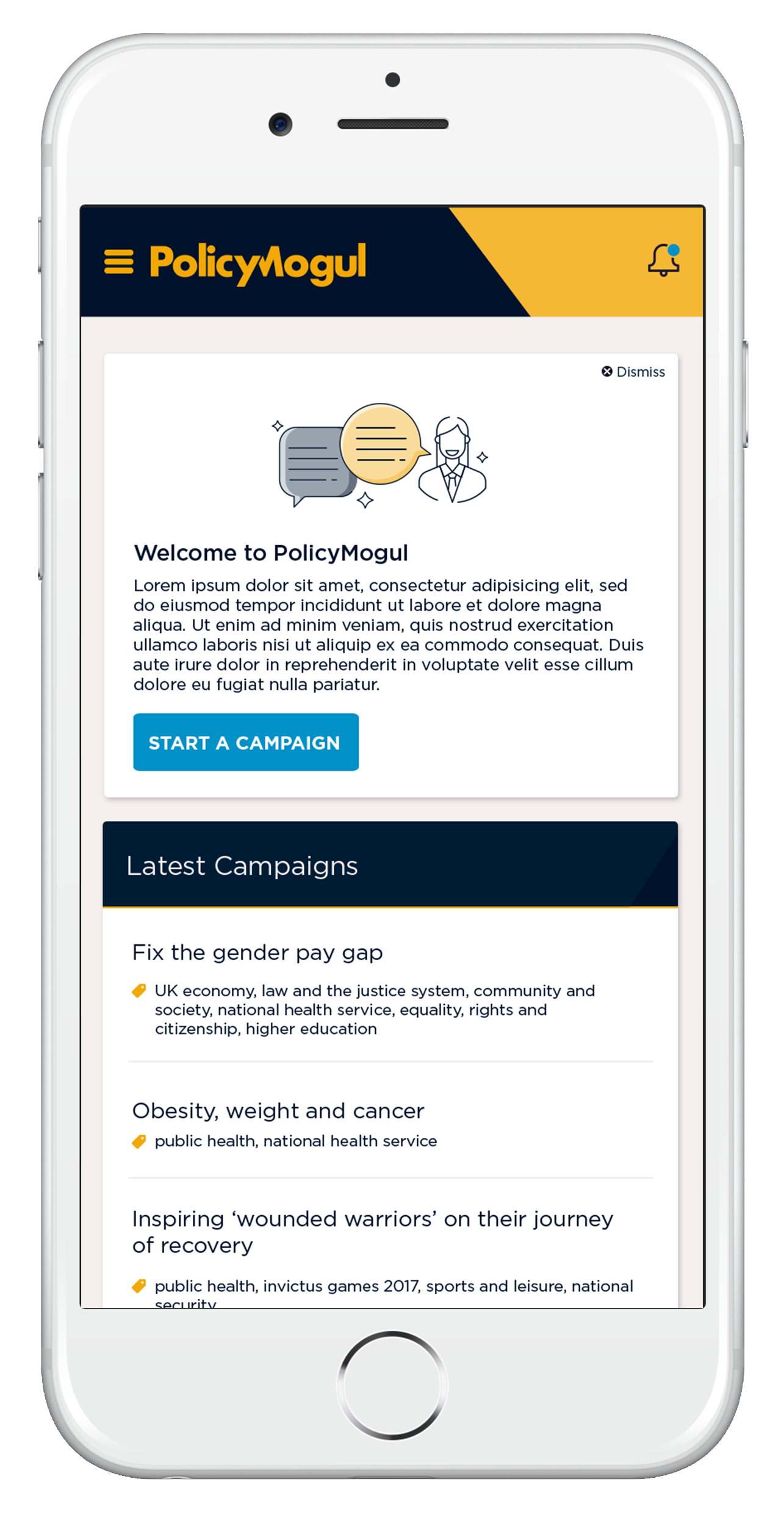
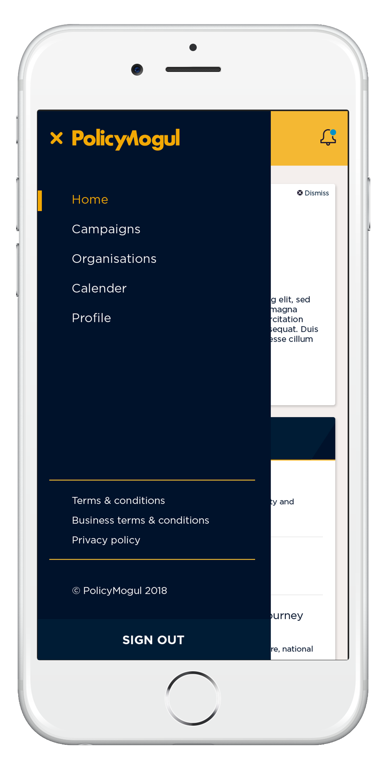
Final website - Adding the brand to make the website come to life
The branding throughout the site hints at the collaboration aspect of the service and has slices throughout to represent this. The playful branding was layered on top of the wireframes to create a bold and engaging look & feel.
An online colour hierarchy system was used to distinguish accent colours from background colours and illustrations used through to visually communicate some of the more complex sections of the product.
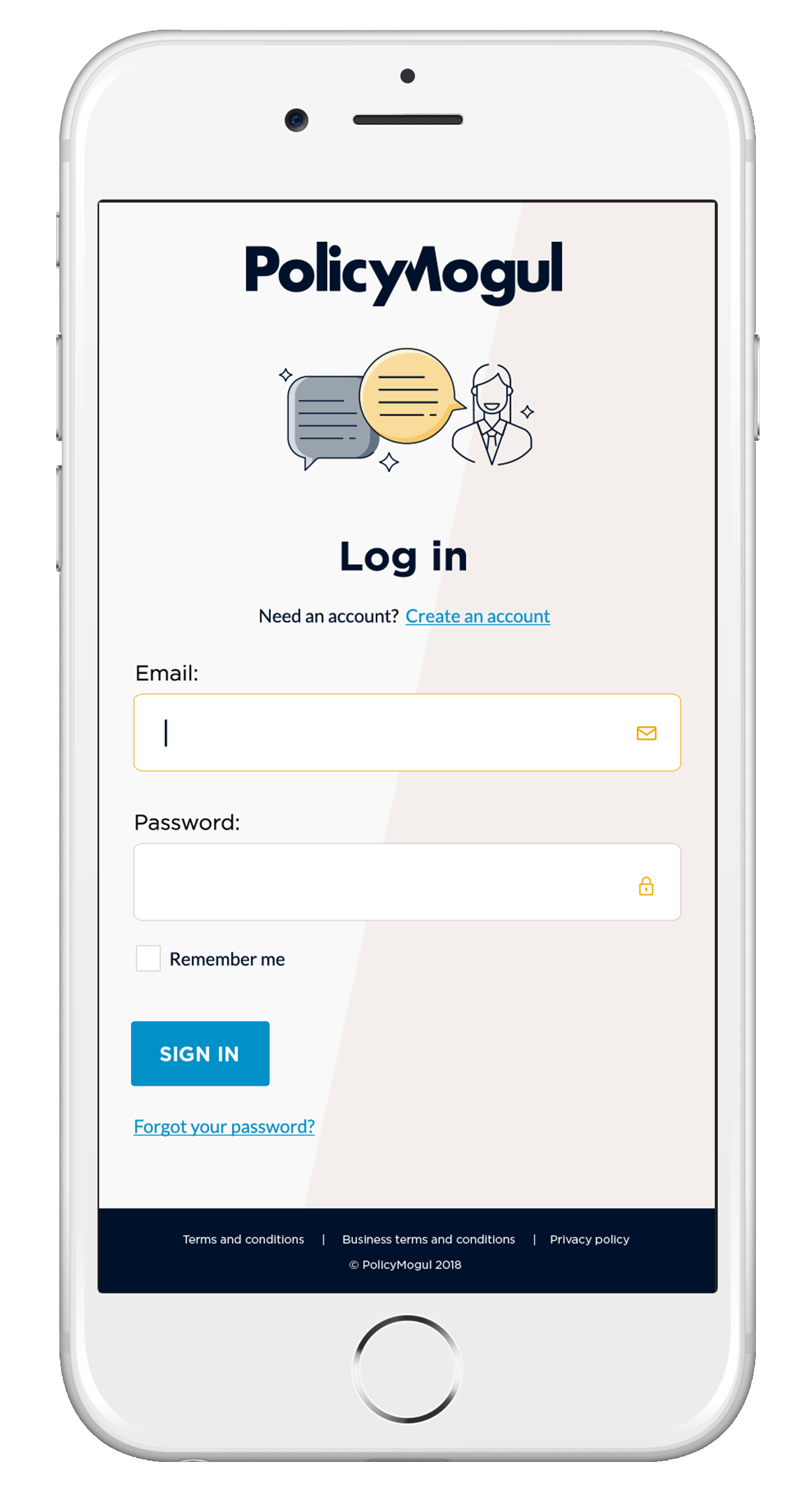
Building a design system for the product
Components created for the product itself taking the branding, core elements were designed that would be implemented within the product. These were

Testing the design system across the product
The screens below show how the design system would look like rolled out across the product, additional the UX audit best practice suggestions were implemented. This was tested on mobile and desktop screens.


Custom animations were created for the website for engagement, communication and to drive interest.


Results
- 20% increase in sign ups post redesign
- Industry brand recognition grew once site launched
- Industry brand recognition grew once site launched
Credits:
Agency: Brand and Deliver
Agency: Brand and Deliver