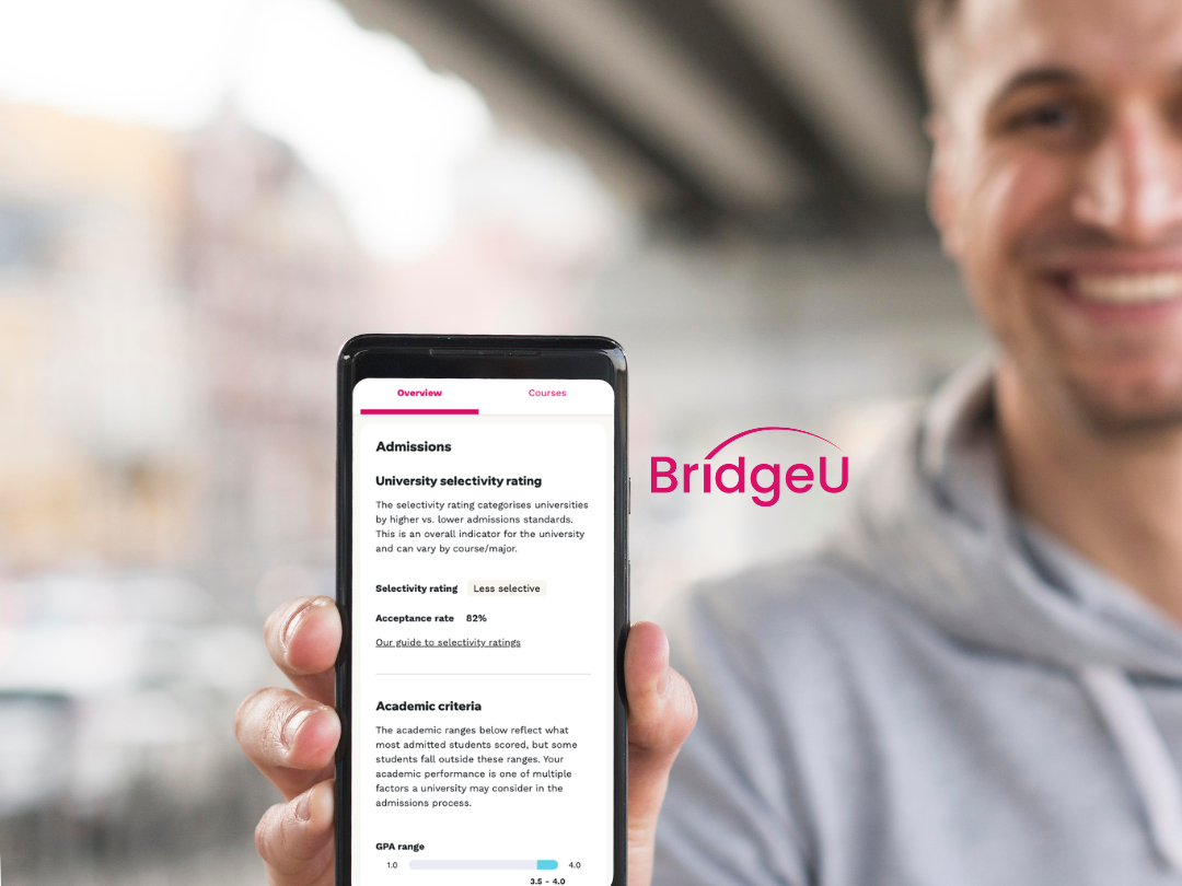
Who are BridgeU?
Edtech company BridgeU are an all-in-one university and careers guidance platform designed for international schools. BridgeU's core users are students, school staff and university partners.
Project roles/timelines
8 week discovery - 6 week build
PM/Product designer/Engineering team
Roles - UX/UI/Strategy/User research/ User testing
Objective
PM/Product designer/Engineering team
Roles - UX/UI/Strategy/User research/ User testing
Objective
Transform an underperforming search experience into a monetisable conversion funnel for paying university partners, whilst ensuring the core user (students) needs are fulfilled.
Metric/aim
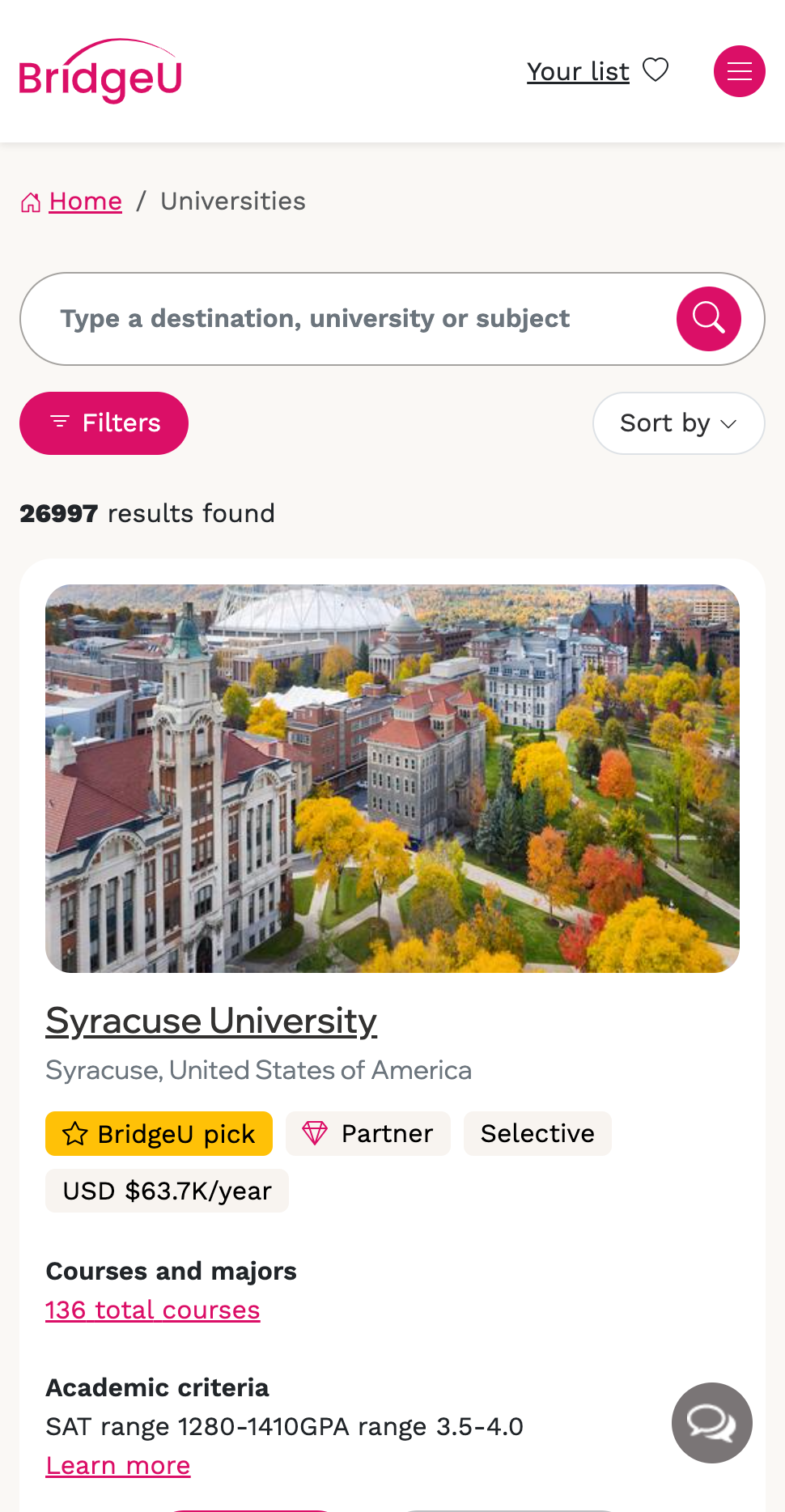
● Increase partner profile views coming from search
Problem with the old experience
● Low student engagement: Only about one-third of students used the search feature
● Low student engagement: Only about one-third of students used the search feature
● Lack of intent understanding: The system couldn’t interpret what students were actually looking for often ending in dead ends
● Ineffective partner promotion: Partners were not prominently or contextually featured in results
● Limited monetisation potential: The poor experience reduced the effectiveness of the platform as a conversion funnel for paying partners
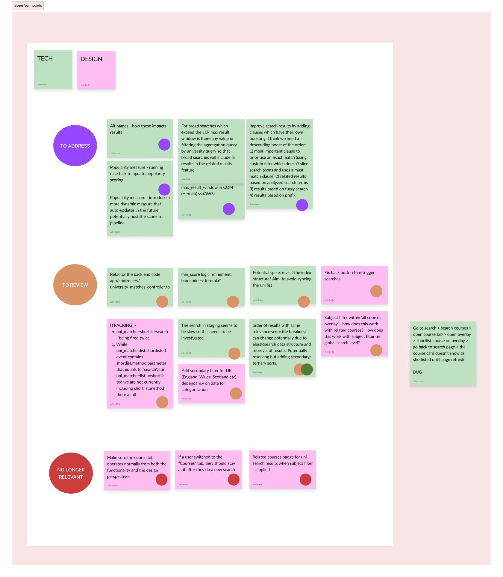
Research and understanding needs
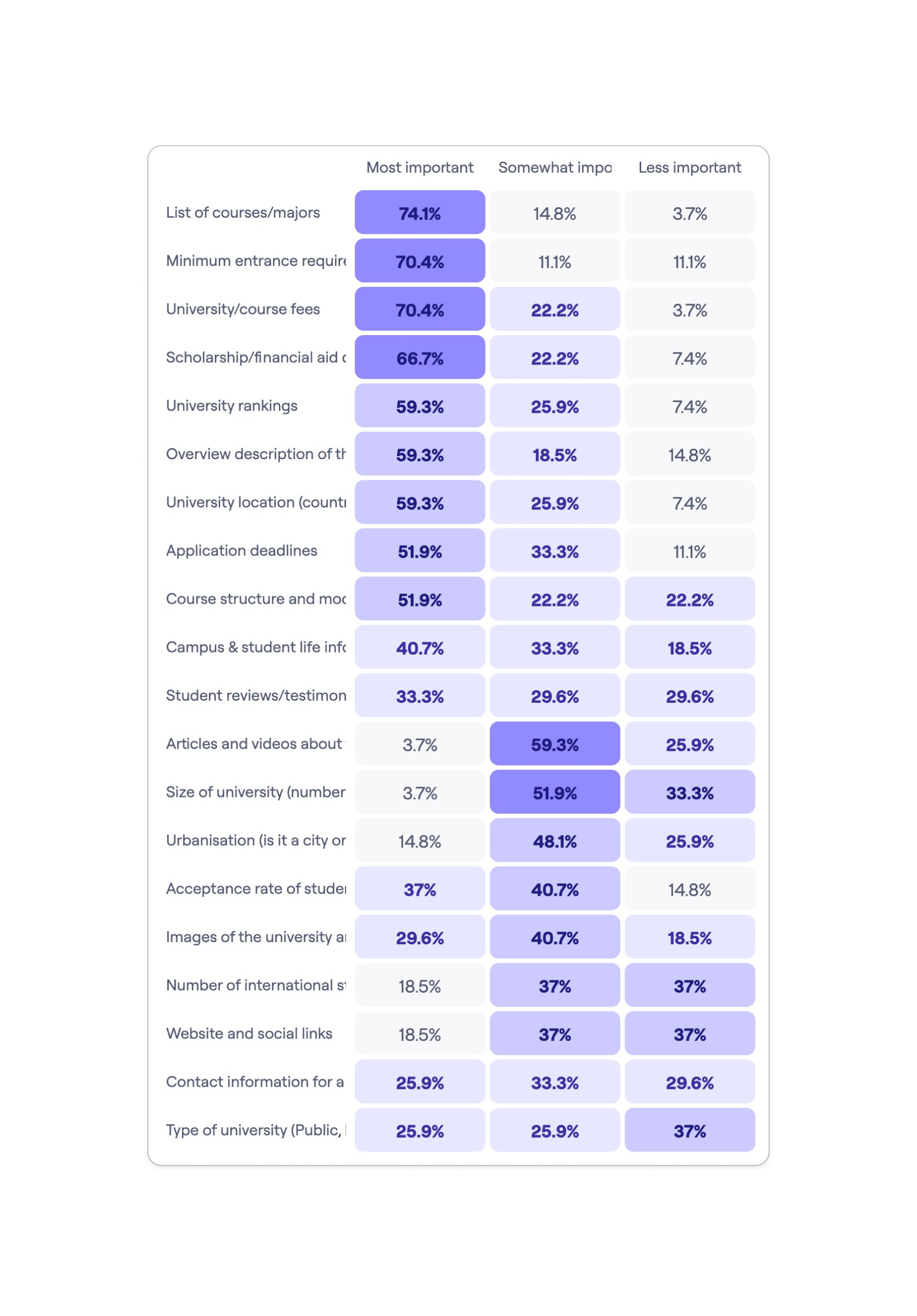
The redesign initiative began with a comprehensive review of previous projects, user research, and feedback to inform the new approach. Alongside research calls, qualitative surveys were sent to students to gain insight in the most important data points when looking for universities. Collaborative workshops with the engineering team took place, aimed to develop a long-term technical solution while addressing existing technical debt.
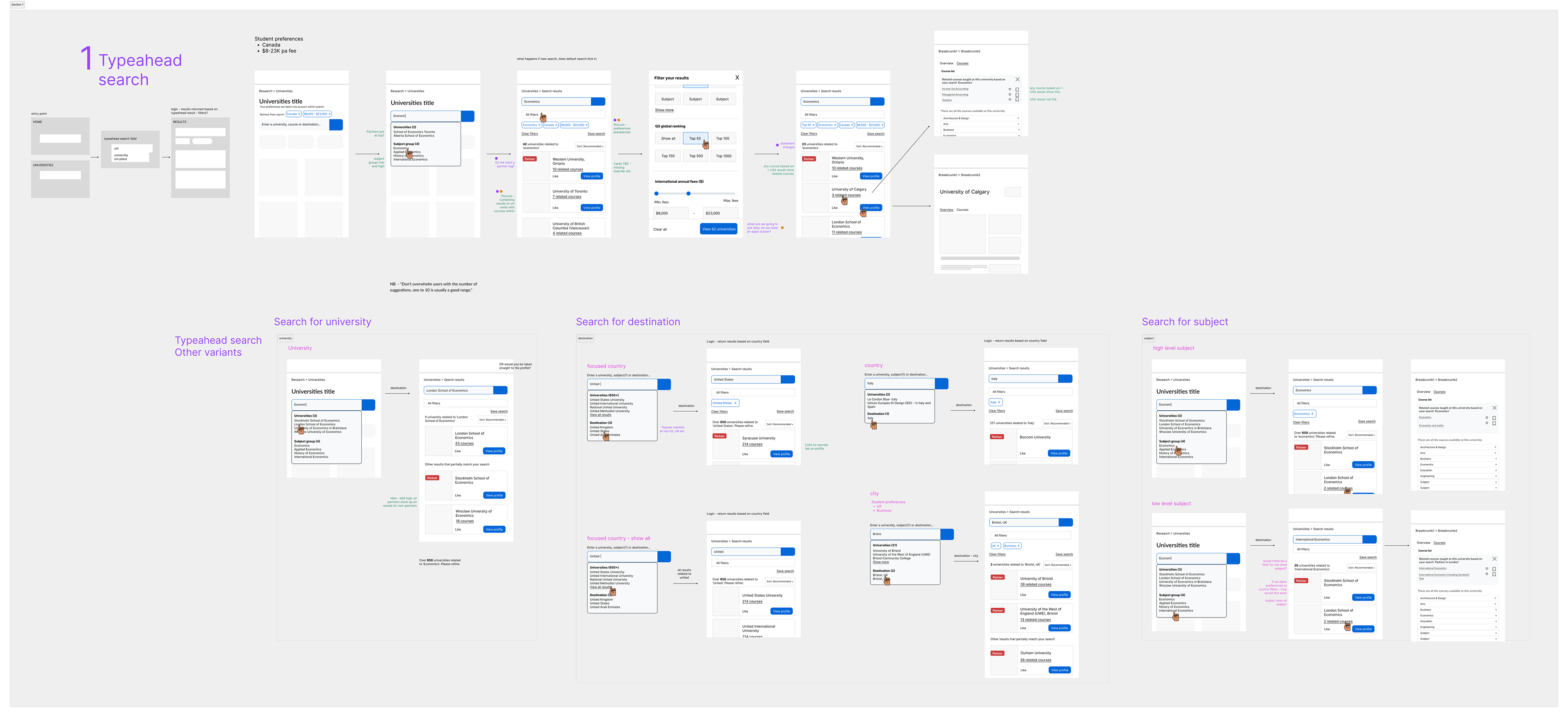
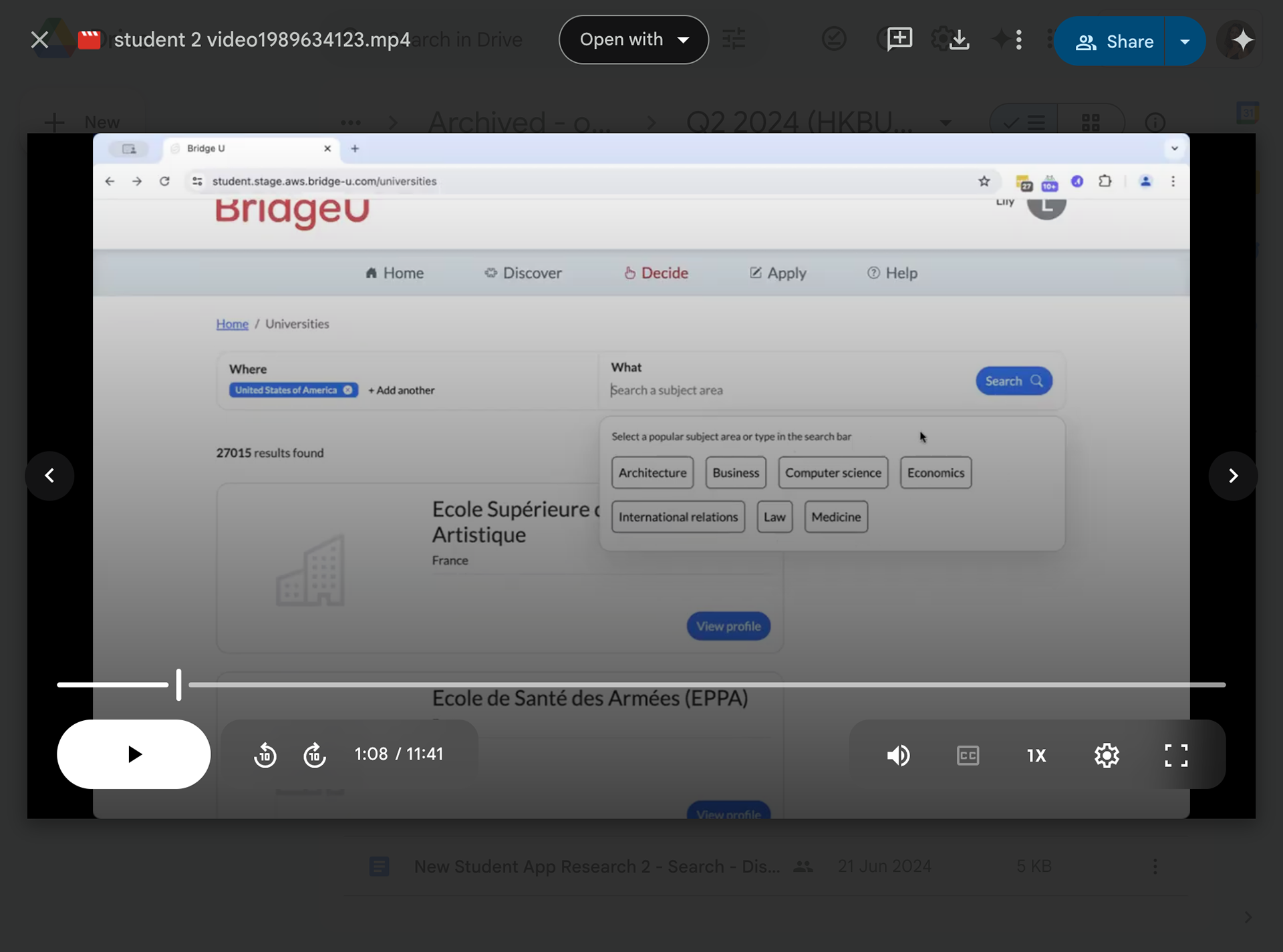
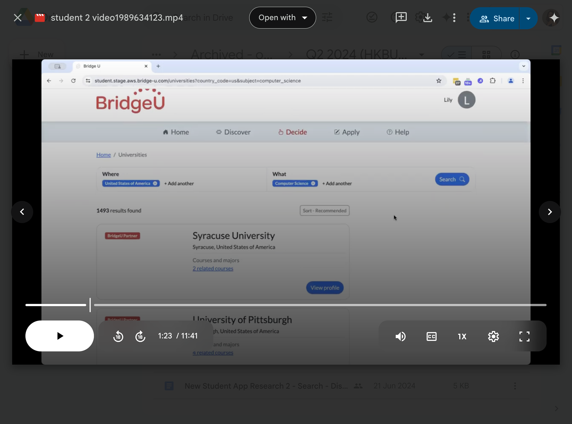
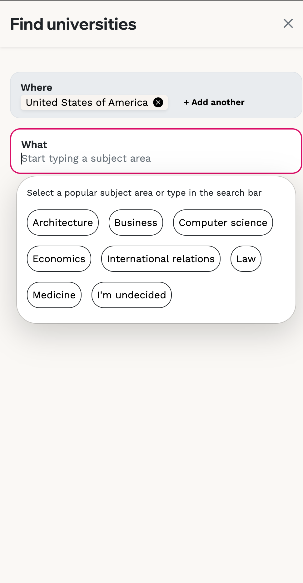
Designing the correct approach for user's
Three approaches were shared with senior stakeholders and a split search flow was selected to better capture user intent, enabling more relevant and contextual partner placements. This approach allowed for the integration of a sophisticated typeahead, selective ordering and tackled dead ends by supplying additional results on specific queries.
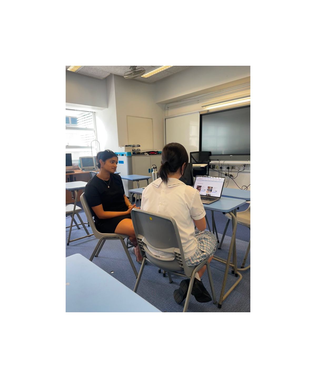
User research + beta testing
Students in Hong Kong took part in in-person observations to test early designs, a beta phase was rolled out to a selection of schools to debug and gain fast feedback before the full launch.
Outcomes
Students in Hong Kong took part in in-person observations to test early designs, a beta phase was rolled out to a selection of schools to debug and gain fast feedback before the full launch.
Outcomes
● Overall students thought this experience was better than the previous version
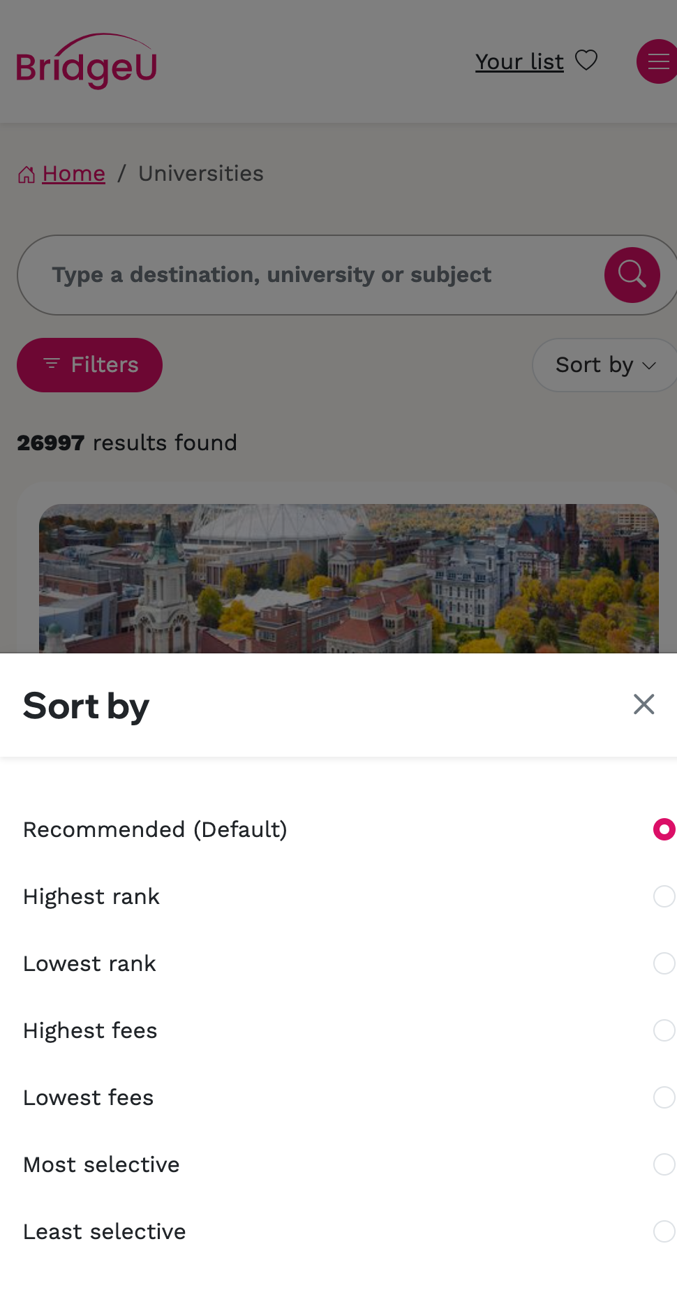
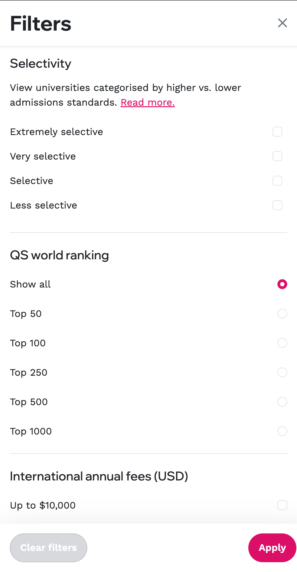
● Students were expecting filters in the early testing, which were made a 'must' for full launch
● Students liked being able to pre-select countries + subjects and hoped in future this would be personalised to their preferences
Implementing and creating a new design system
A new company-wide design system was in the process of being created and this project focused on filters, sorts and a selection of components that drove users through the funnel. I worked close with the front-end engineering team to make sure this was feasible and future-proof.
A new company-wide design system was in the process of being created and this project focused on filters, sorts and a selection of components that drove users through the funnel. I worked close with the front-end engineering team to make sure this was feasible and future-proof.
Outcomes/results
● x3 more partner profile views in first month than current platform at same time
● 79% of partner profile views came from search (compared to 31% in the previous pattern)
● Drove a shift in search behaviour toward broader queries, expanding result scope to enhance partner exposure
Overall, the revamped search experience turned a previously underperforming feature into a powerful tool that effectively addresses user needs while advancing key business objectives.
Feedback from students/schools post launch
‘Found it quick and easy to find universities’
‘Understands what you want to do quicker and better’
‘This is an improvement, especially like the country suggestions when you click in the search bar’
To delve deeper into this problem space, a full length case study is available.