SUMMARY
Owned the design and launch of a new search experience, strategically integrating partners into relevant results to boost conversions
Problem - BridgeU's old search had low student engagement and poor result relevance, with users often getting confusing or dead-end results.
Approach
• Created a spilt search bar experience to drive direct but broader results to understand student intent and monetise on the end-to-end experience.
Approach
• Created a spilt search bar experience to drive direct but broader results to understand student intent and monetise on the end-to-end experience.
• Partner institutions were embedded contextually in search results to increase visibility and relevance.
Results achieved
• A 48% increase in partner profile views within six months
• A 48% increase in partner profile views within six months
• Drove a shift in search behaviour toward broader queries, expanding result scope and enhancing partner exposure
Full case study below
WHO ARE BRIDGEU?
BridgeU is an all-in-one university and careers guidance platform designed for international schools. BridgeU enables students to explore international universities and empowers them to make more informed decisions. BridgeU's core users are students, school staff, and universities.
THE NEED
Transform an underperforming search experience into a monetisable conversion funnel for paying partners, whilst ensuring students needs are met.
THE SITUATION
We began by reviewing previous work—vision projects, research, and feedback on the current experience—to ensure a well-informed approach. A workshop with engineering focused on building a long-term tech solution while addressing existing tech debt. Regular collaboration between product, engineering, and leadership ensured alignment on key experience design decisions.

Problems with the old search feature
• Only one-third of students used the old search, making it unsustainable for long-term revenue.
• Search results were often irrelevant (e.g., searching “UK business” surfaced “University of Kentucky”).
• Lack of contextual understanding made it hard to deliver relevant results or promote partner institutions.
• Inconsistent design patterns across the site led to duplicated efforts in showcasing partners.
• Elasticsearch limitations made it difficult to boost partner visibility.
• A single search bar returned mixed data types (universities, countries, courses), creating confusion.
• Users hit dead ends with no guidance or alternatives after empty search results
• Customer feedback highlighted expectations for a more intuitive and effective search experience
Business goals of a redesigned search experience
• Students regain trust in the search experience in order to engage with the CTA and move through the funnel
• Broaden search results to include a variety of partners across the different types of searches
• Identify right placed partners in the most relevant searches to drive best chance of clickthrough
• Maximise opportunities within search to promote partners
The student needs for the experience
• Find relevant results to search terms
• Search a specific university
• Search a destination interest
• Be able to search subjects that interests me
DISCOVERY
Firstly we wanted to refresh ourselves with any previous work that had taken place; vision projects, relative research calls and feedback on the current experience to have the full knowledge going into the project. A workshop took place with the engineering team to see how we wanted to make sure our tech solution was for the long term and removed any tech-debt we had occurred. The product, engineering and leadership teams had frequent meetings to discuss and ideate such a core part of the new experience to make sure all stakeholders were informed of proposed designs.
Initial considerations
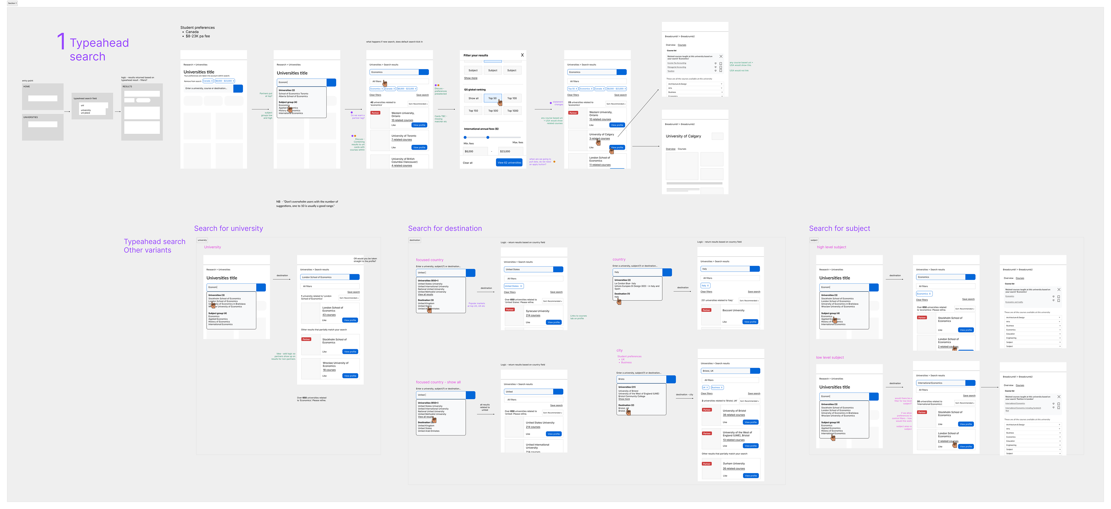
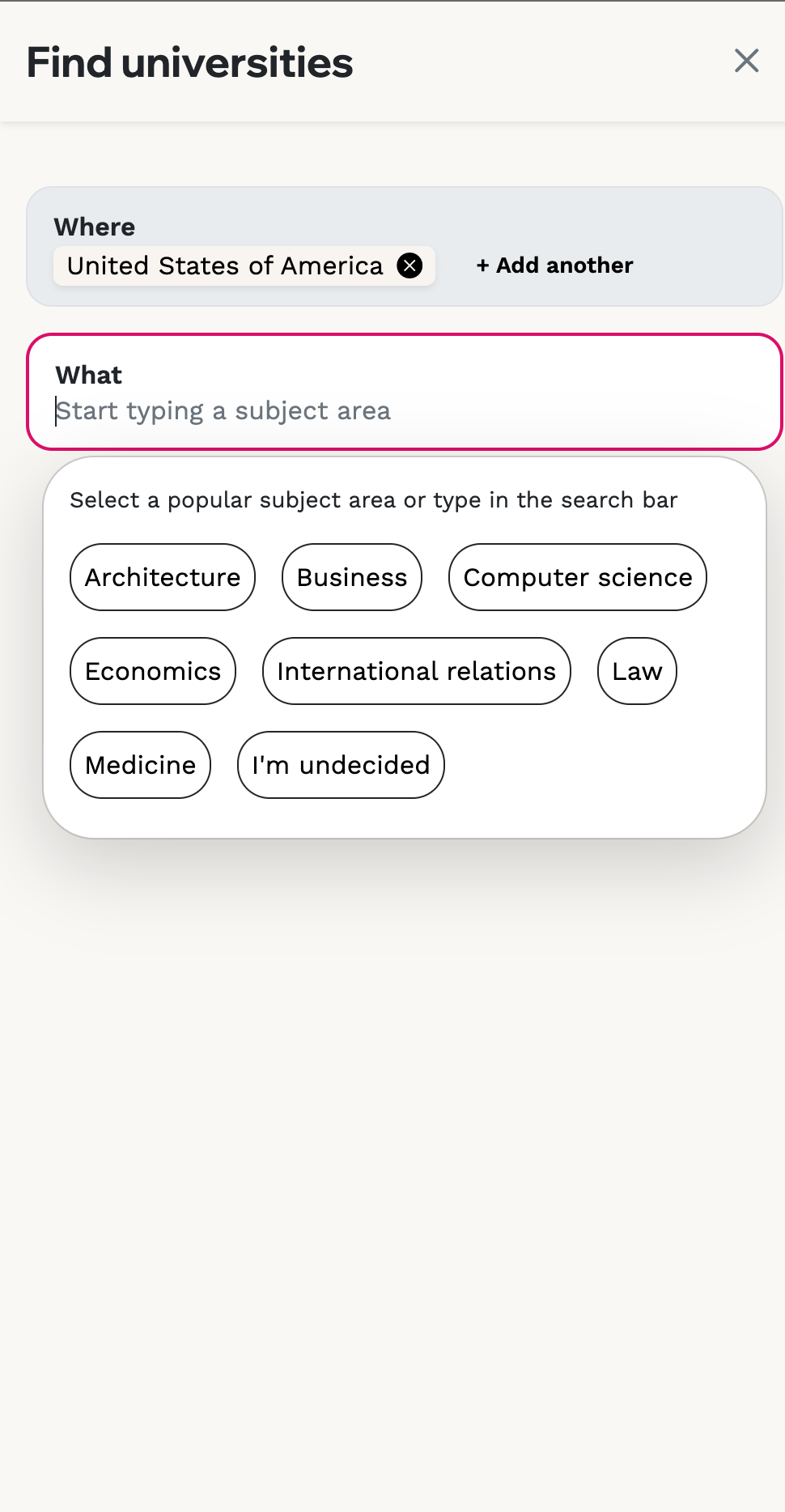
• There are 3 types of searches - a university, a destination and a subject
• How can we include student preferences into the search results
Three different concepts were taken to the senior leadership team.
• A single search flow - results would be related to keywords inputted
• A spilt search flow - Constraining 2 fields (universities and destinations) so they had direct results while one field (subjects) was part constrained to subject areas but also allowing a keyword search
• A bucketed approach - all results would be placed in buckets but no search field as such
The focus shifted to getting the basics right—creating a core experience that meets current student and business needs, with room to evolve. A split search was chosen to better understand user intent, enabling more relevant partner placements based on set destination and university queries.

iNITIAL THINKiNG
Search journeys driving the user needs
The split search was iteratively designed around the different search types, highlighting essential elements at each stage. Built on new tech, it enabled ground-up innovation—using typeahead to capture context but also allowing us to prioritise partners in the results.
Testing and validation
While we had early validation of the proposed format—since most B2C competitor products used a split search pattern with "where" and "what" fields—we wanted to validate it further through real user testing.
Working with a top-tier school in Hong Kong, our product team conducted in-person user interviews that lasted 10/15 minutes each with a curated discussion guide to test the following:
1. Does the student understand how to use search?
2. Do the results match the user's expectation?
3. Can the student search and find courses easily?
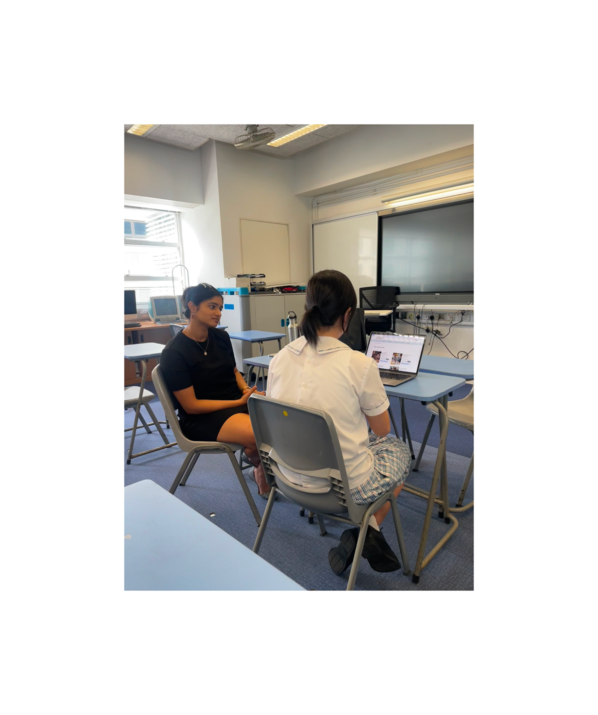

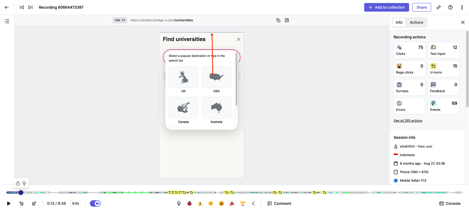
The sessions were recording via screen share for further analysis.
Outcomes of student testing
• Overall students found the search function on home and under Discover
• Students found the search experience better than the previous feature
• Some students thought they were only restricted to the suggested options in search and didn’t seem to understand they could type
• Some mentioned wanting or expecting sort and filter options
• No students mentioned the introduced ‘BridgeU partner’ tag
• Some students entered results which returned 0 results
Recommendations from testing
• Introduce copy in the search bar and above search suggestions to let the user know that they can also search by typing
• First ship to include filters with a fast follow of more filters and a selection of sorts
• Look at ways to improve the 0 result journeys
A phased beta launch with select high-value schools, including key markets like China, allowed us to gather insights before the full release. Feedback from users, HotJar, Looker, and Amplitude data informed ongoing improvements.
A new design system and brand was created post wireframes which had to be implemented before the Beta release.
A new design system and brand was created post wireframes which had to be implemented before the Beta release.


Additional student testing
Before launch, we observed UAE students using the product to complete key journeys and gauge their reactions. Most were entering their final year, had prior BridgeU experience, and had some idea of their study goals.
Before launch, we observed UAE students using the product to complete key journeys and gauge their reactions. Most were entering their final year, had prior BridgeU experience, and had some idea of their study goals.
Most issues, like adding Europe as a region and support for special characters, were already with engineering. Other feedback, such as saving to a list from search, was noted for future enhancements.
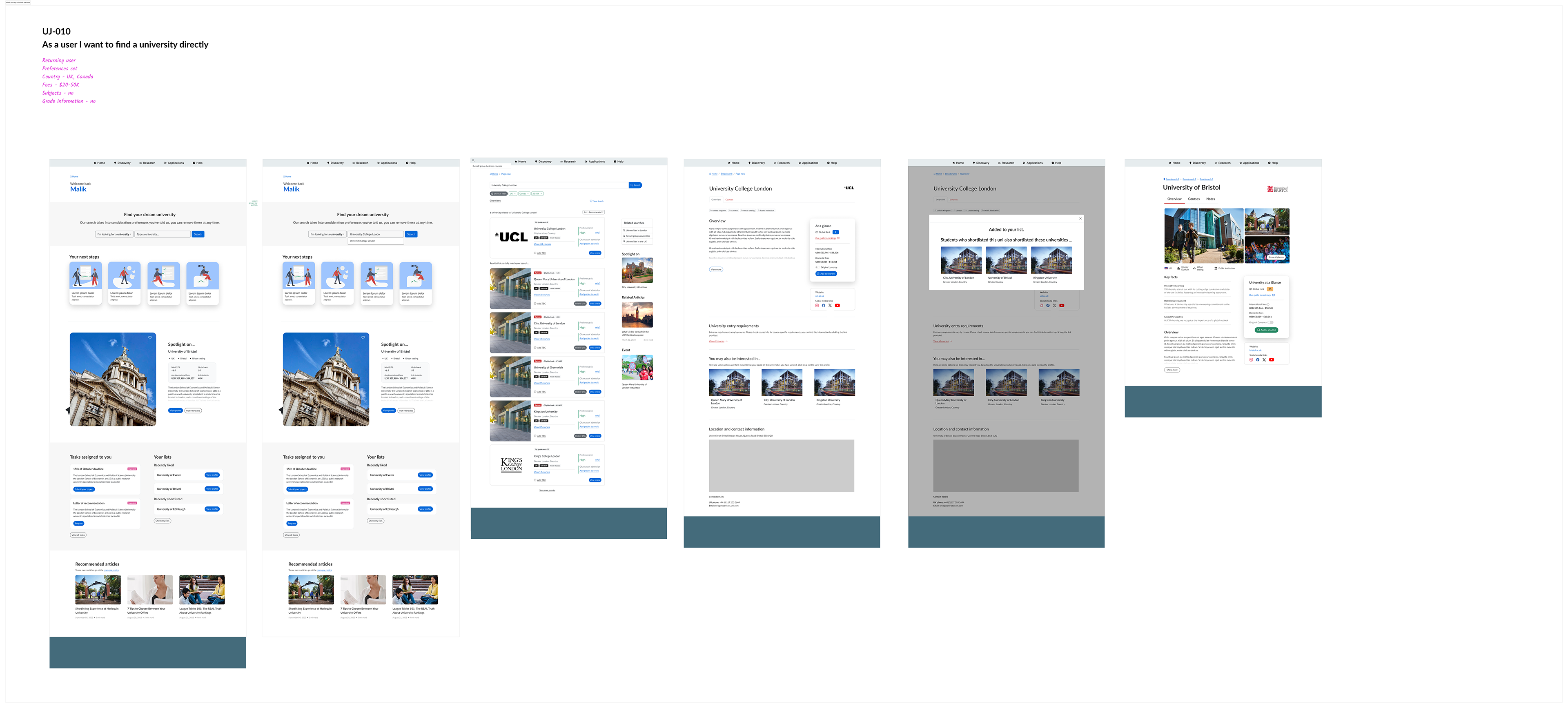
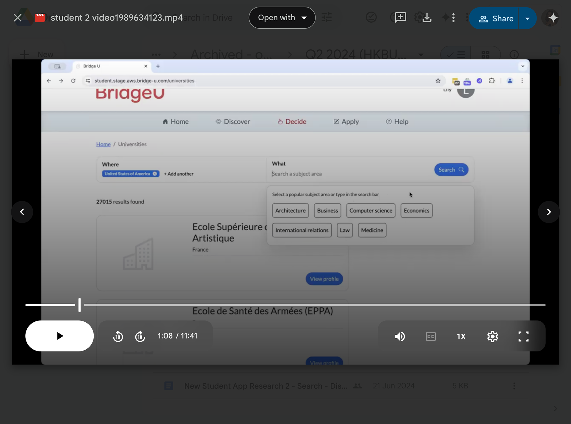
THE CORE USER JOURNEY
Video shows the core user journey of a student from the homepage spilt search bar to a partner university profile.
As well as core user journeys there were several key areas to focus on to execute the new search experience;
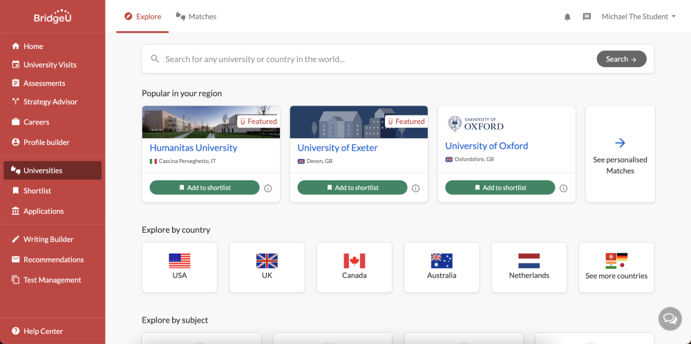
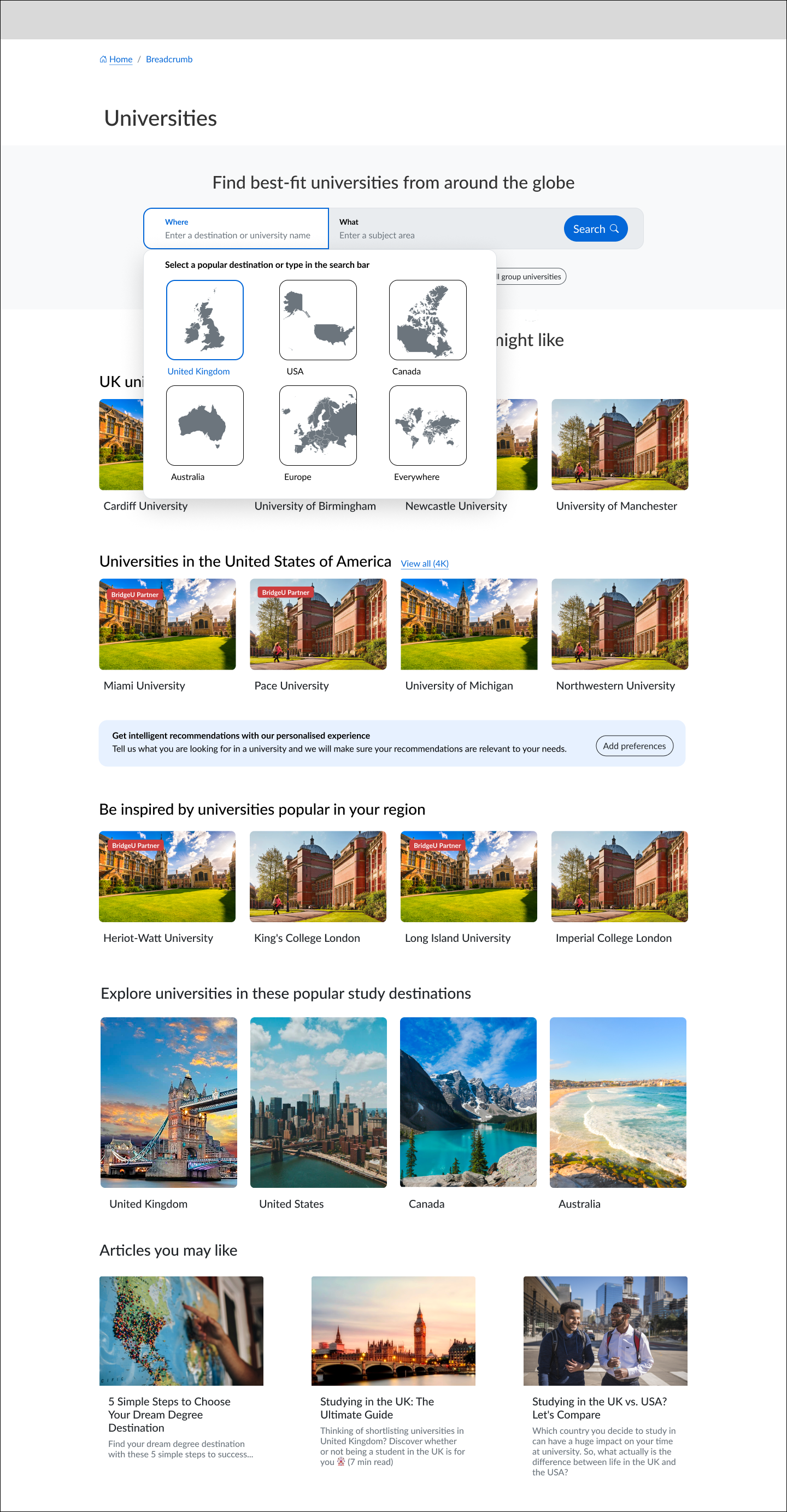
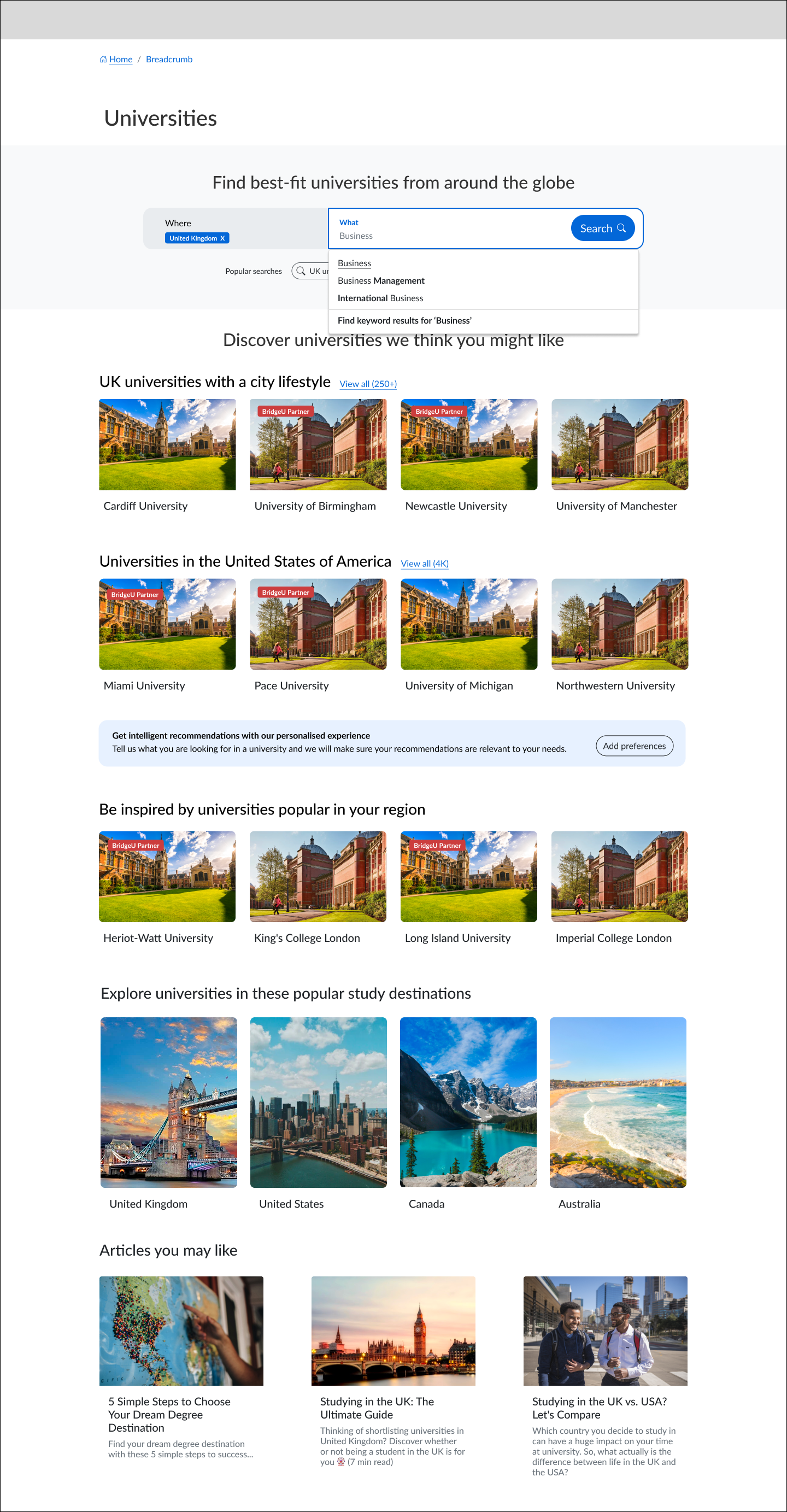
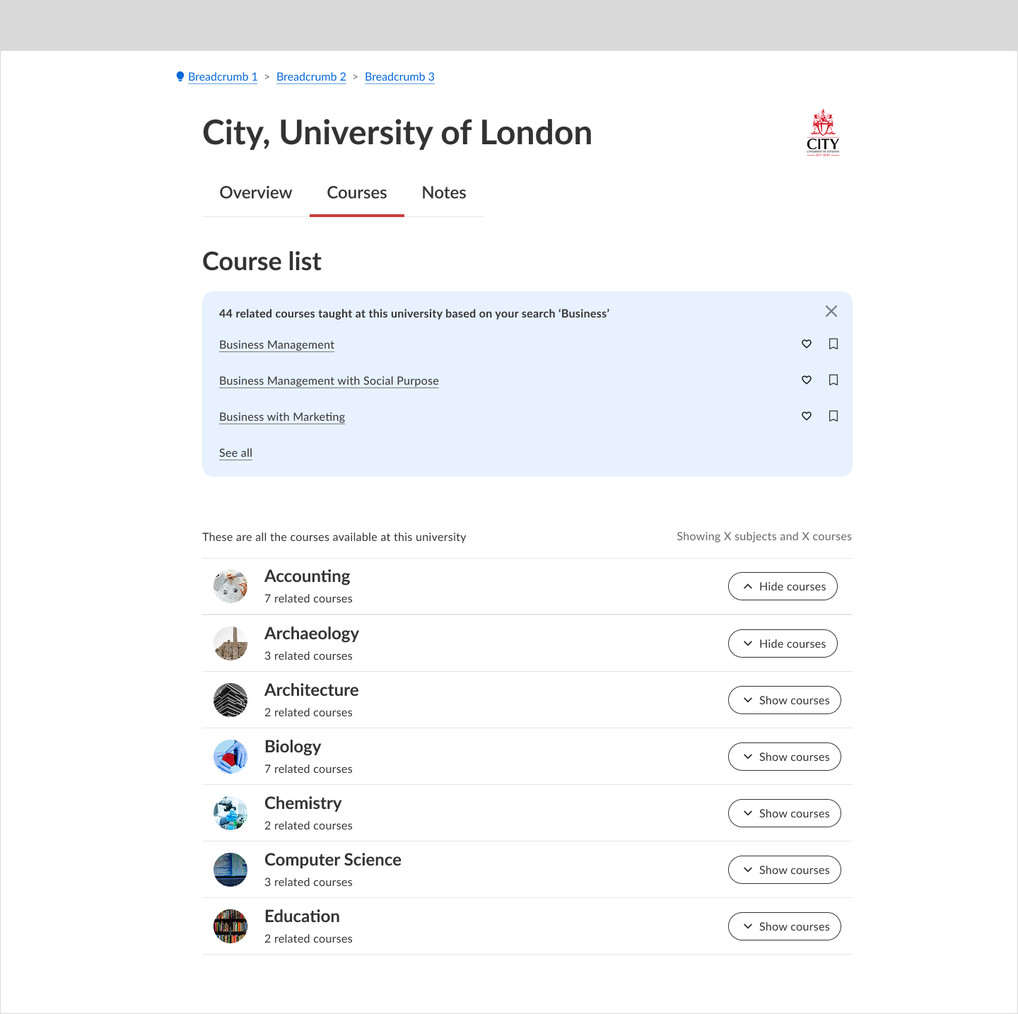
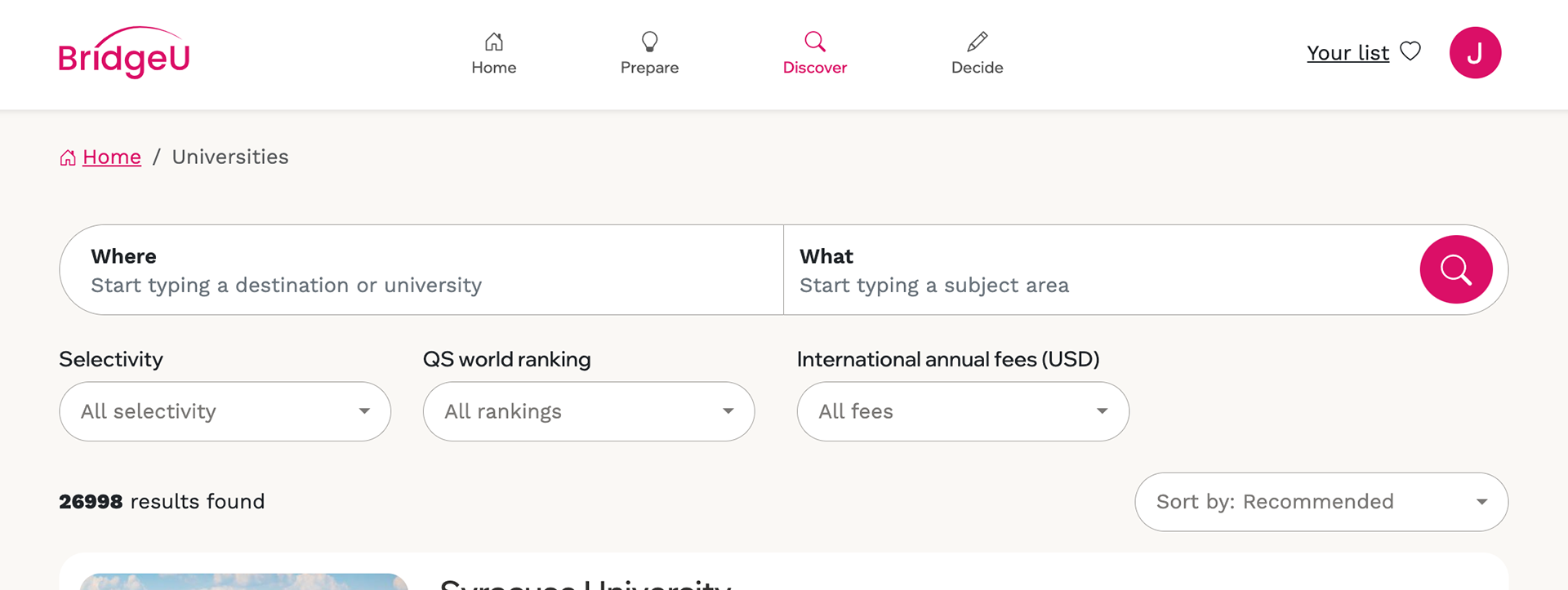
A spilt search bar to deliver broader results
A split search bar with ‘where’ and ‘what’ fields was implemented on both desktop and mobile
What = Destinations (countries, regions with future plans of cities, states)
What = Destinations (countries, regions with future plans of cities, states)
What = Universities
Both of these are direct search terms that correlate to a direct result.
Where = Subject areas, can be a direct correlation and return a collection of areas or a keyword search which looks up with a subject name within a set of results.
Both of these are direct search terms that correlate to a direct result.
Where = Subject areas, can be a direct correlation and return a collection of areas or a keyword search which looks up with a subject name within a set of results.
This allowed for broader results, with typeahead suggestions of key markets and popular student interests.
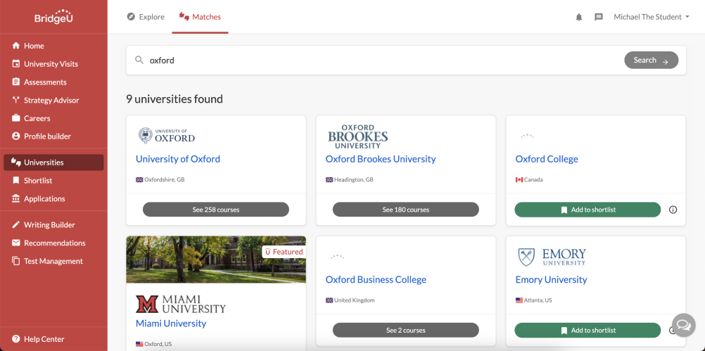
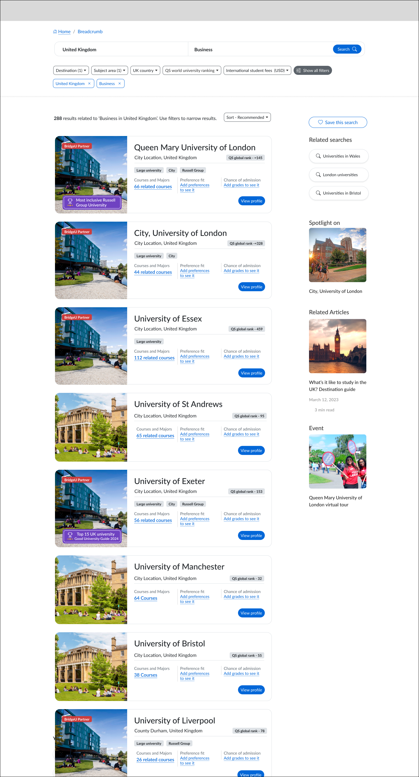
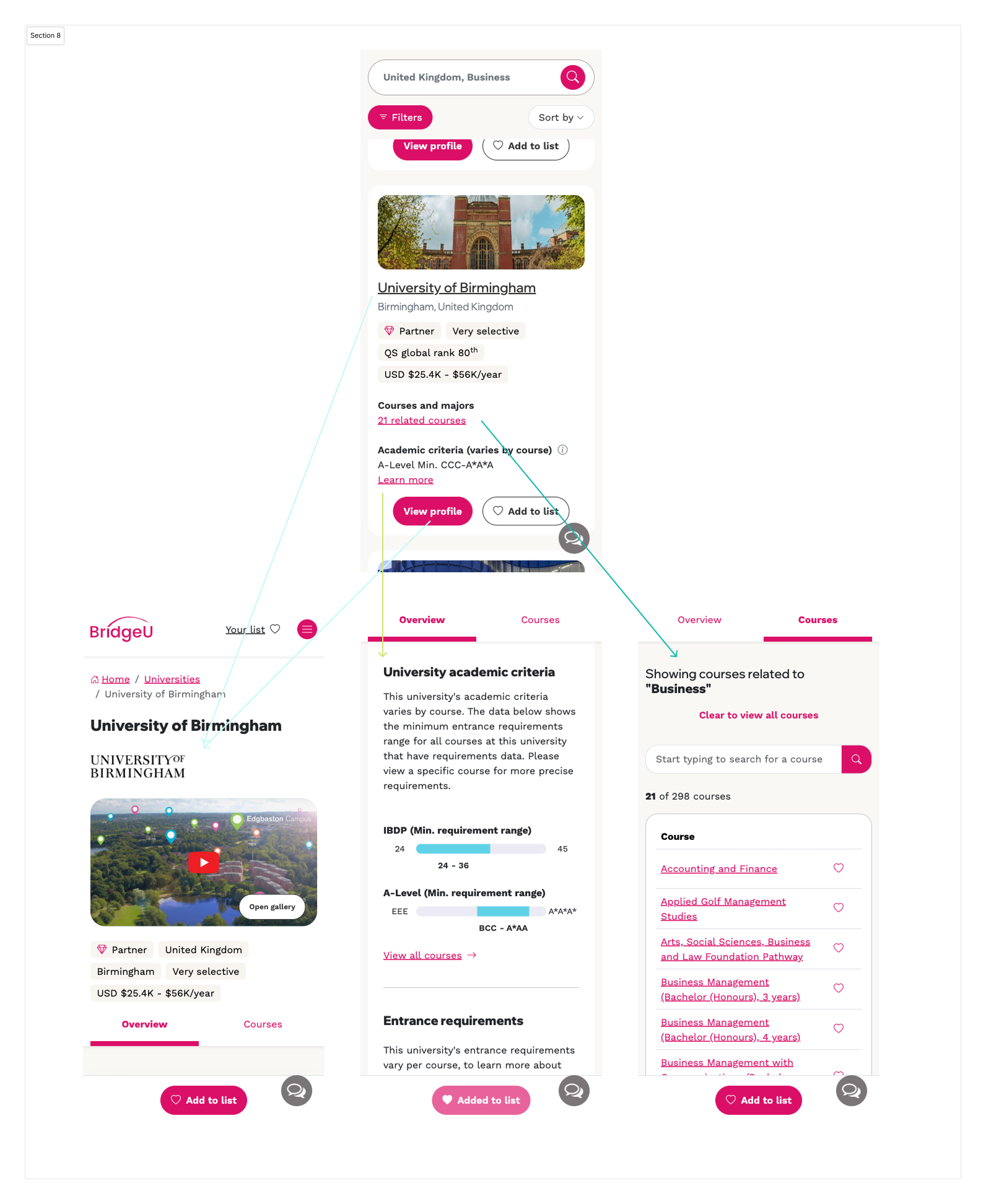
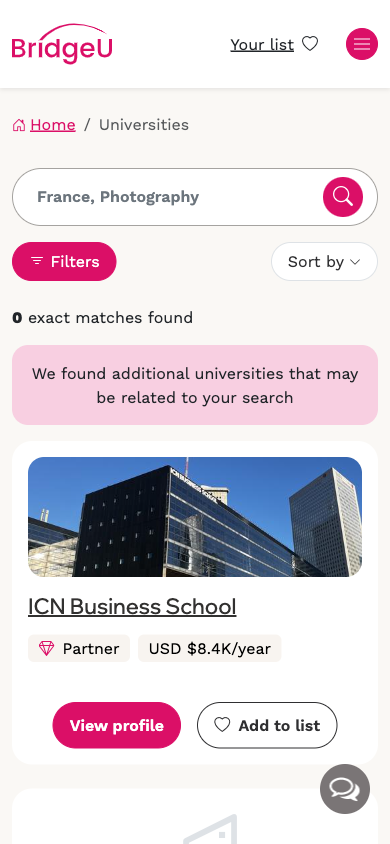
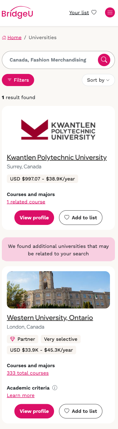
Search cards maximising entry points to profiles
Search cards were reimaged with key data points added allowing multiple entry points. The images below show how these cards were maximised to encourage click throughs
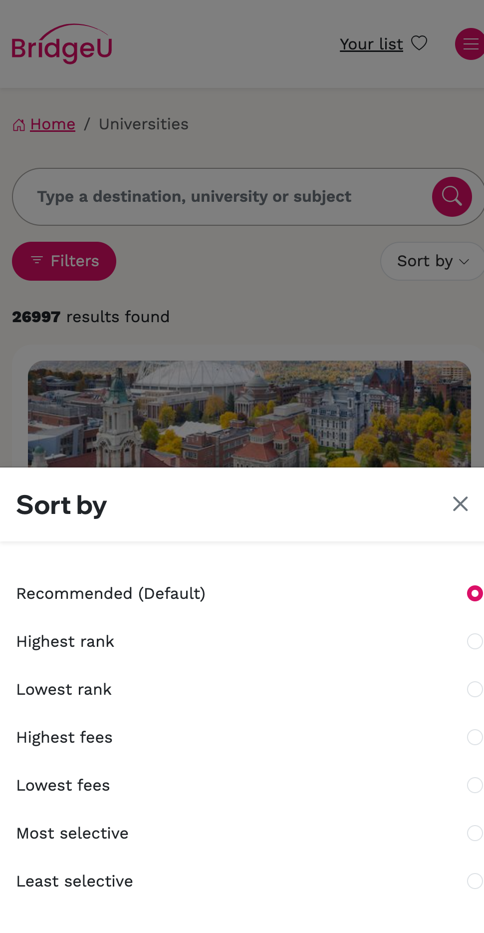
Filters and sorts redesigned and future proofed
The new design system required custom filter patterns and components for mobile and desktop, built for usability and future growth. Filter and sort options were informed by data, student research, and beta feedback, with high-impact features prioritised and released in phases.

Related results mechanic to drive profile views
During our interviews we saw some student’s searches ending in 0 results, this is primarily due to data constraints on courses but can be due to the nature of the search. We decided to implement related results that partially match the search criteria so students can explore relevant options, this was another opportunity to promote partners.
Uses cases included
• Performed a search with 0 results
• Performed a search term returning in less than 10 results
• Performed a search for university & subject, but the university doesn't offer the subject
The related results displayed up to 10 results with partners prioritised before non-partners, within this included partner tiering, with more valuable partners positioned higher than others.
We took the opportunity here to go back to a business goal to maximise opportunities within search to promote partners by adding the related results logic for;
• Performed a search for a non-partner
This would allow us to maximise the traffic of non-partners as an opportunity to promote partners whilst broadening the results for students giving them other relevant results.

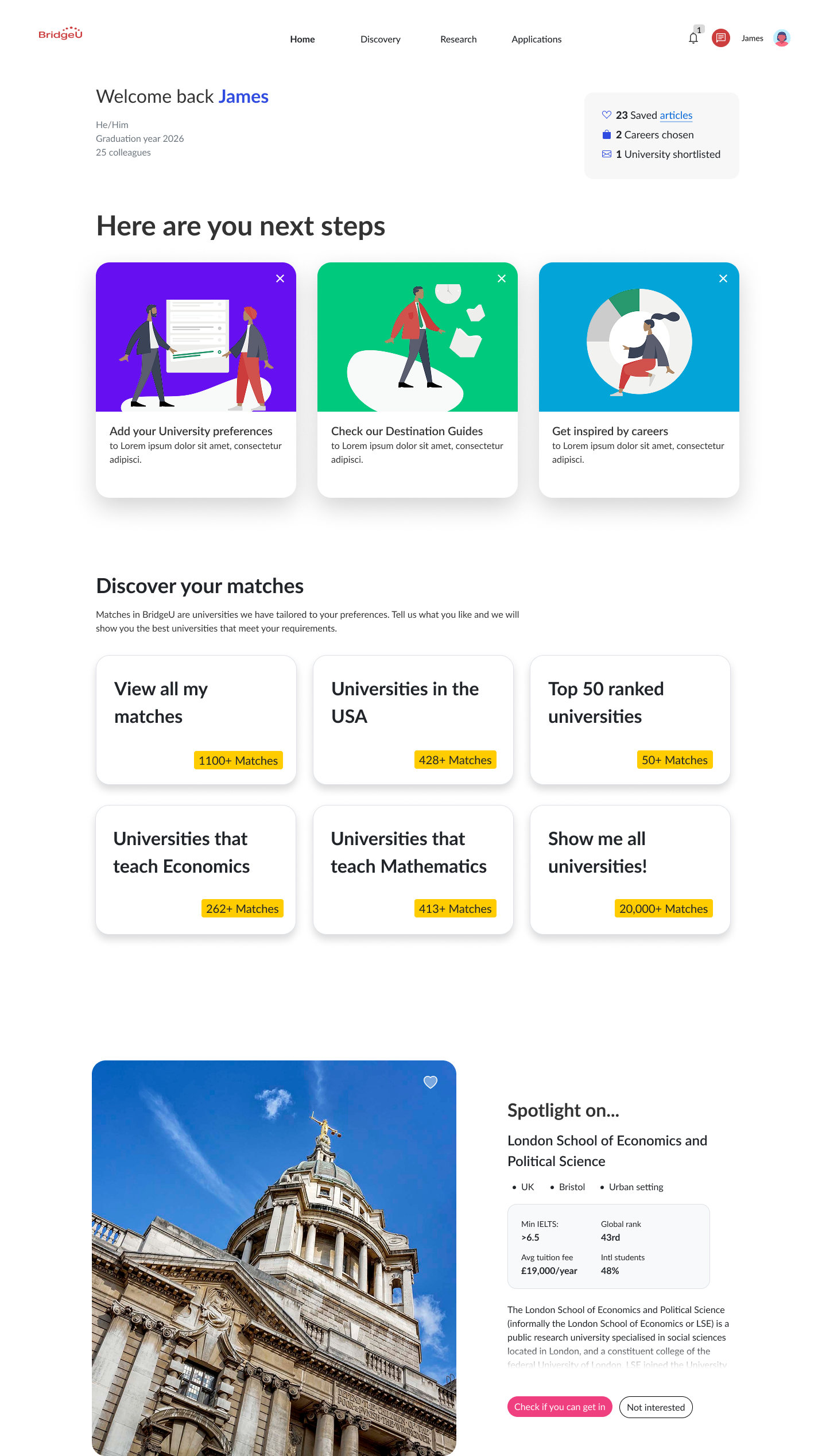
Monetising the student journey by driving traffic to search
We streamlined the student journey to better monetise results, directing traffic to search via popular categories and quick searches. Future plans include saved searches and curated buckets like ‘Russell Group universities’ to focus engineering efforts on improving partner results within a single search experience.

RESULTS
Beta outcomes
• x3 more partner profile views in first month than current platform at same time
• 20% increase all students viewing a profile on the new app vs previous
• 25% increase for graduating year (key target cohort)
Post launch outcomes
Within six months of the new search experience being launched, search had overtaken over funnels to convert the highest proportion of profile views on the platform;
• 82% of profile views came from the new search experience (compared to 69% in the previous pattern)
• (75% from search results and 7% from related results within search)
When talking about partner interactions particularly,
• 79% of partner profile views came from search (compared to 31% in the previous pattern)
• 7% of partner profile views came from related results within search
The transition in search behavior was successful, with ~80% of 'where' queries now focused on destinations, maximising partner visibility. In contrast, the old app saw ~80% of searches targeting specific universities. This shift broadened results, aligning with business goals and enhancing partner exposure, leading to projected revenue growth.
Early data showed that the top university in search results received significantly more traffic, enabling us to experiment with additional revenue streams and upsells.
Feedback from students/schools post launch
‘Found it quick and easy to find universities’
‘Understands what you want to do quicker and better’
‘This is an improvement, especially like the country suggestions when you click in the search bar’
Reflections
Early stages considered student preferences within search which confused some elements of the design process and should have been a stand alone project.
Given the nature of the data loads, some UX compromises were necessary to ensure the overall solution ran smoothly. Collaborating closely with the engineering team, we explored various options and selected the one that provided the best balance between performance and user experience.
Students questioned how the previous matcher experience would be integrated. The student need being ‘am I the right fit for this university’, in future releases this was executed by a series of features including calculating the selectivity of a university, the academic criteria needed to get in and academic fit compared to a student’s grade.